How to Make an Effective and Practical Patient Leaflet.
Introduction
This blog is going to be similar to "How to make a clear, concise and appealing medical poster" that I previously wrote since the approach is very similar. A patient information leaflet, however, feels more personal. It helps patients knowing more about their disease, how to control it by means of medication or other (such as diet, habits, socio-economic changes, et cetera). This allows them to be less frightened and have some reassurance [1].
Patients can take these leaflets home and read at their own leisure and maybe share their new knowledge with a member of the family. It is a vital piece of information that helps the patient outcome and an extension of ongoing pharmaceutical care [2]. It is found that 97% of patients, of those interviewed, have significantly improved in terms of knowing information about medications, side effects and their disease [3]. 71% of patients have read their leaflets the first time and 87% of repeat users have read their leaflets in some time of the past [3]. The side effects section was most commonly read and 11% and 15% of first-time users and repeat users respectively said that they have taken action as a result of the patient information leaflet [3]. Patient information leaflets are becoming more and more felt in terms of knowing more and as a reminder at home by the patients [1, 2].
I will highlight how to make a decent, good and clear patient information leaflet.
Where should you start, and how?
First things first:
Do you have a topic for your leaflet?
Do you know how many team members are going to be present? - if you are doing it as a team or solo.
What is the due date?
Who is the leaflet for? - this is very important in terms of pictures that have been chosen and language used.
Make a social media group. That can be anything (Facebook, Whatsapp, Messenger, Line and others) so that anything can be discussed immediately and everyone is in contact. Also, make a google document and possibly a Dropbox so that the document can be easily shared.
Some do their leaflets on Powerpoint as you can change the ratio easily or alternatively Photoshop works really good.
If you really want that design feel and look, I highly recommend Canva (it is free!) and Adobe Illustrator.
A quick exercise you can do to start
Get a piece of paper and jot down these ideas:
Google some leaflets and review font images and choices of colour. What colours shall you use?
Write down agreed choices as well as relevant web links for later use. This is very important for referencing!
Write down a brief overview of the disorder (definition, epidemiology, symptoms, risk factors, aetiology and prevention).
Write down a brief overview of the normal structure and function (relevant, accurate, concise details of relevant normal anatomy / physiology / biochemistry).
Write down a brief relevant, accurate, and concise description of the pathophysiology.
Draw the organisation and flow of all content in a diagram to attempt to make it self-explanatory.
Discussion of a management plan to have the leaflet completed a week early ready for printing, this can include ‘team roles’ of researcher/s, creator/s, printer/s, etc.
What level of participation do you require from each group member?
Here is a video made by the Australian Government: the Therapeutic Goods Administration on patient information leaflets, click here or click on the image:
The first steps towards your leaflet
Discuss the topic and leaflet content as a group.
Make a literature review of the chosen topic.
Get the title right.
Graphs and pictures tell the story. Remember to be culturally sensitive when using a pictogram.
Consider size requirement (it will likely be an A4 page, used on both sides) and what you can include.
Is your leaflet bifold or trifold?
Don’t forget a reference list.
Don’t forget to add your names and/or group name or number.
Discuss a management plan to have the leaflet completed a week early ready for printing.
Version control – how to work on it without there being a version issue e.g. two people working in the same file separately.
Making sure all objectives are met, that is where the marks come from.
Leaflet for the pharmacy or the patient?
For the pharmacy
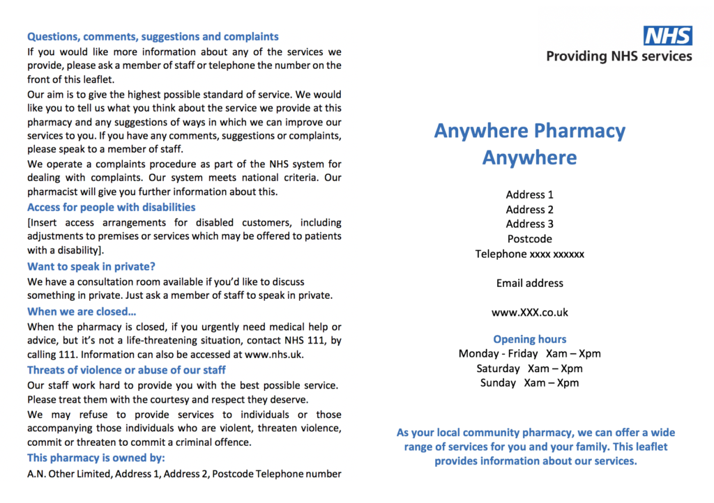
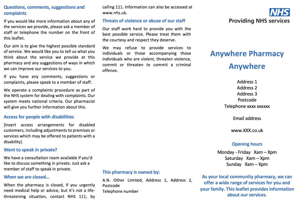
Here the National Health Service (NHS) dictates that a leaflet shall be “…produce in an approved manner, a practice leaflet containing approved particulars in respect of his pharmacy” [4].
The practice leaflet must include the following [4]:
Name, address and telephone number of the pharmacy or if owned by a company based elsewhere, the contact details for their head office.
Opening hours.
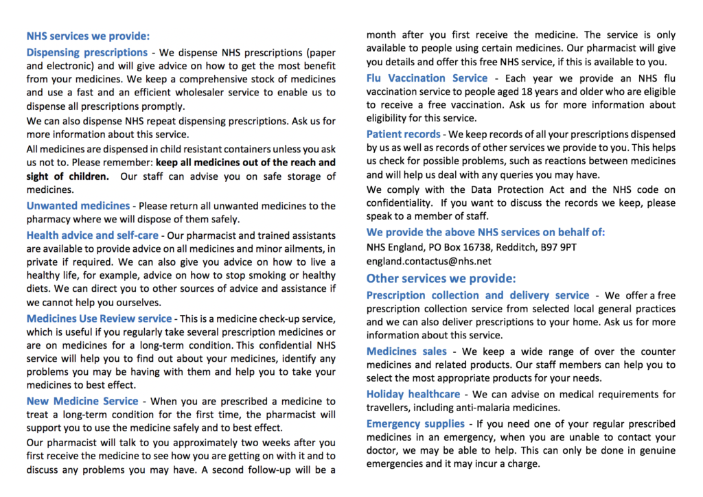
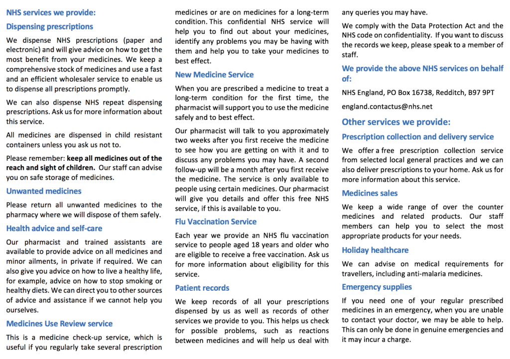
A list or description of NHS services available (can be other if not NHS) at the pharmacy.
Access arrangements for disabled customers, including adjustments to premises or services which may be offered to patients with a disability.
“When the pharmacy is closed or if you urgently need medical help or advice but it’s not a life-threatening situation, contact xxx xxx xxx, by calling xxx. Information can also be accessed at www.nhs.uk”.
A statement that the pharmacy is not obliged to serve violent or abusive customers.
A statement that the pharmacy complies with a certain code on confidentiality.
Detail of how to find out more about services offered, comment on those services, or make a complaint.
The leaflet must be printed using a plain font in minimum size 12 pt, with sufficient contrast between print and background
Here are the patient information leaflets and factsheets with a link to all the diseases for a leaflet at the NHS standards [4]. Below are the NHS examples of bifold and trifold leaflets.
For the patient - criteria needed
Below are some criteria on what to put on a leaflet. Although this may seem a lot, there is no need to add everything in as there is limited space. A concise leaflet is important and every leaflet is dependent on the disease as each disease are treated differently with different management, biochemistry, pathophysiology and so on. Not all leaflets will have the same sections as it is highly individualized.
For example, a leaflet on asthma can have:
what is asthma,
causes of asthma,
triggers,
symptoms of an attack,
what is an acute attack,
treatment,
prevention,
how to use an inhaler.
Size, format and appearance
- includes title, group number & names of group members
- appropriate dimensions, A4 page
- font / images readable
- choice of colours, images, etc must not be distracting
Organisation of content
- order / flow / linking: easy for reader to follow?
- consistency in style, is everything the same font?
- team effort, example: seamless flow between sections, indicative of a cohesive team effort?
- content is self-explanatory
- bifold or trifold
Overview of disorder
- clear, concise and accurate outline of all important aspects of the disorder including:
- definition
- epidemiology (preferably the country you are in)
- symptoms
- risk factors / aetiology / prevention / statistics
Normal structure & function
- relevant, accurate, concise details of relevant normal anatomy / physiology / biochemistry especially that are ideal level for an audience. However, this should not be the main focus.
- excellent use of images to support and enhance information
Pathophysiology
- relevant, accurate, concise description of relevant pathophysiology
- expertly linked to normal physiology
- appropriate level for the audience (peers, patients and other)
Management
- Clear concise, accurate and well-focused description of current major approaches to disorder management including:
- diagnosis, treatment and prognosis as appropriate
- prevention (primary and/or secondary where relevant)
- community health organisations (if relevant)
Referencing
- for maximum marks include > 5 cited references; all cited appropriately in the text and using the list’s correct style
- use Harvard or American Psychological Association (APA)
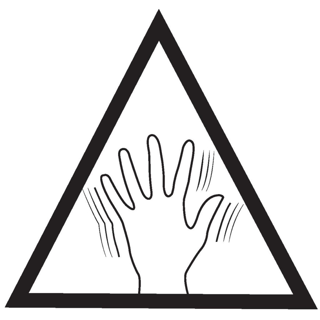
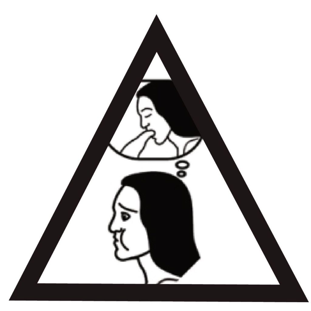
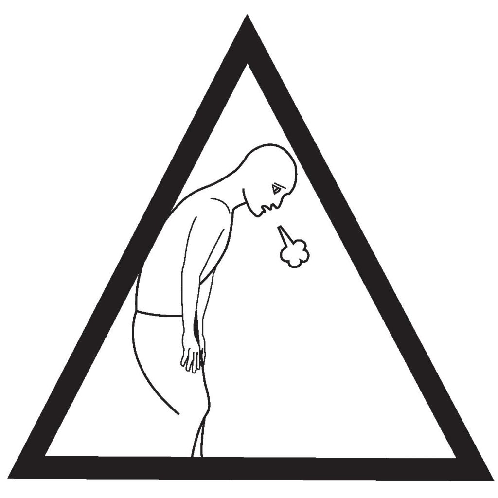
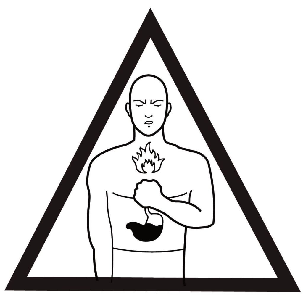
Pictograms
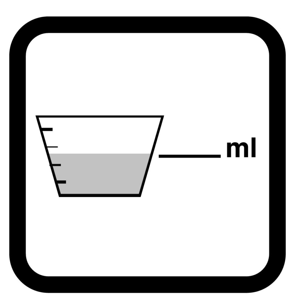
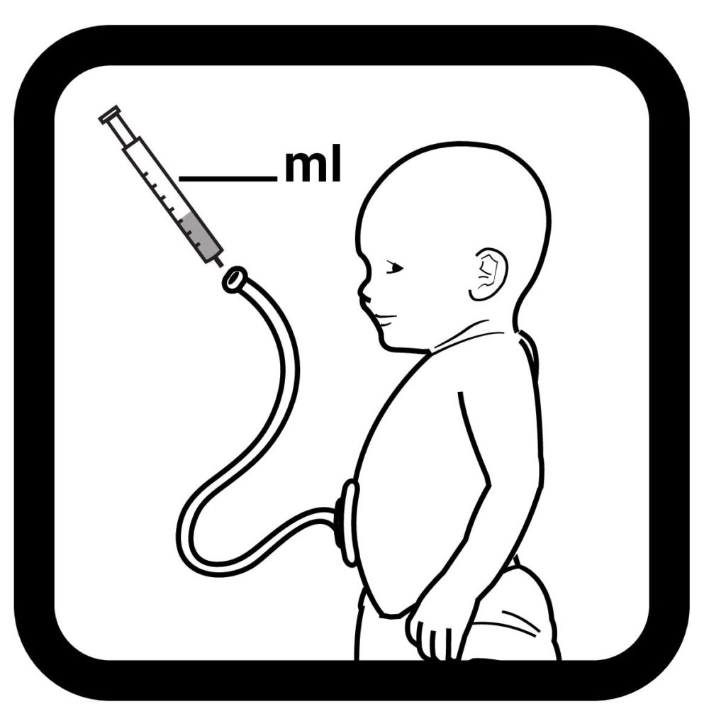
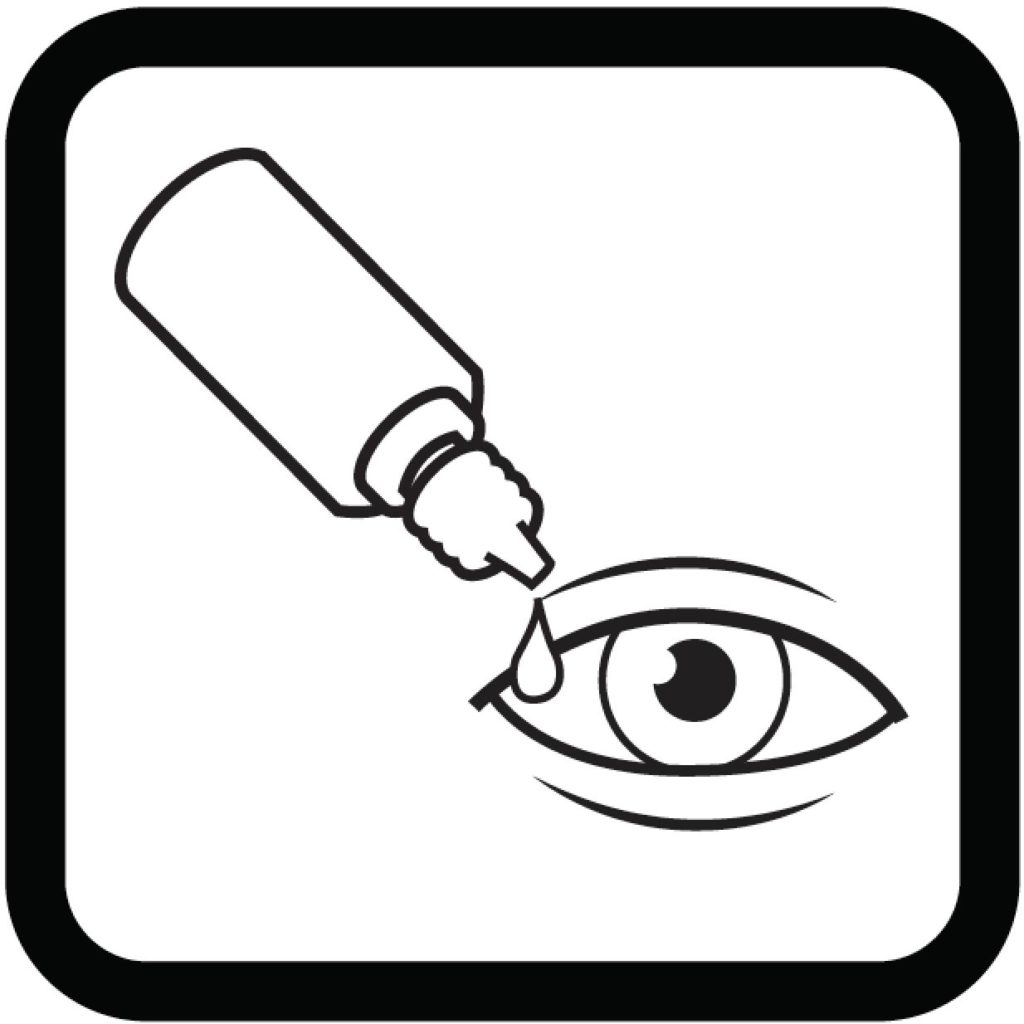
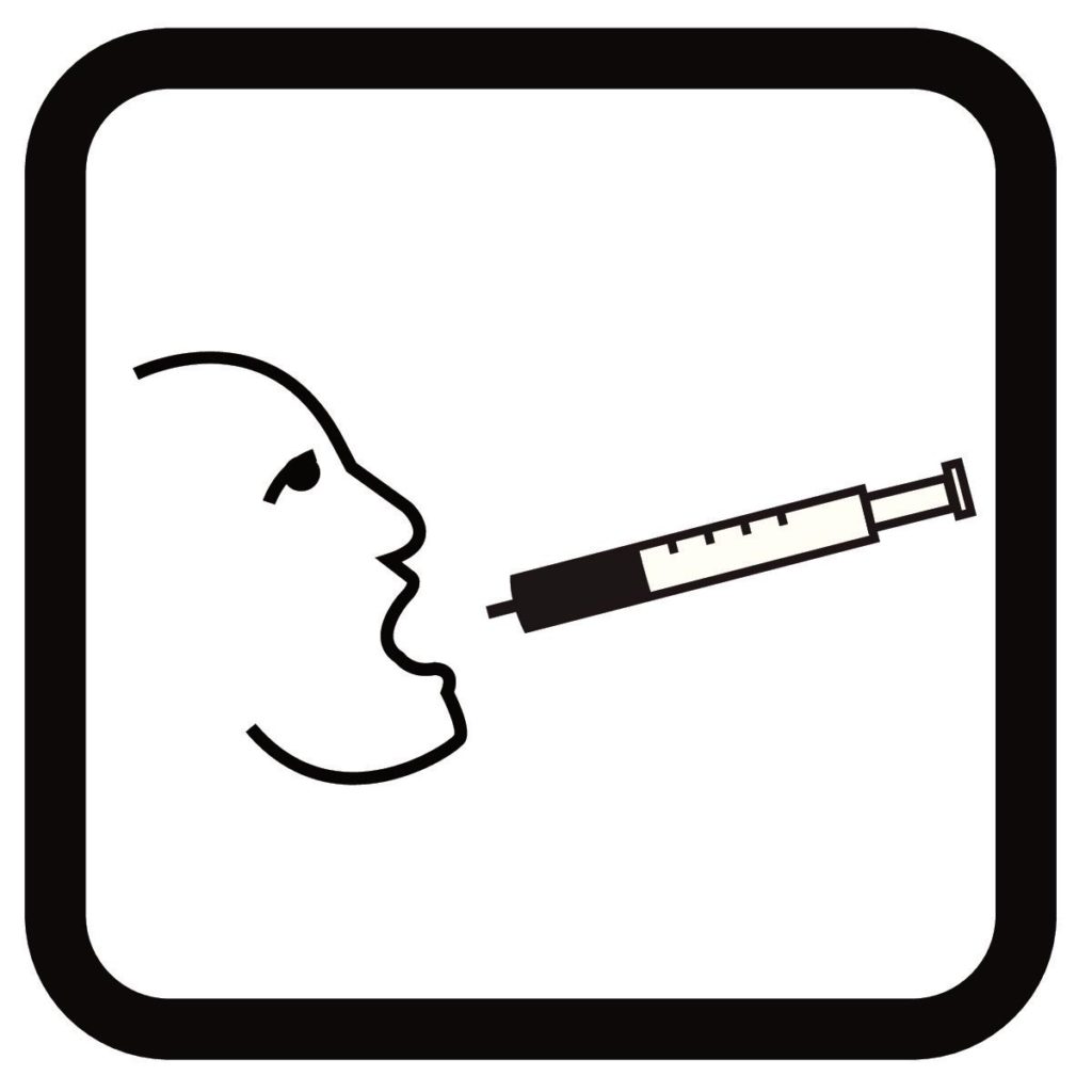
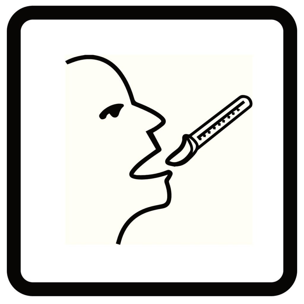
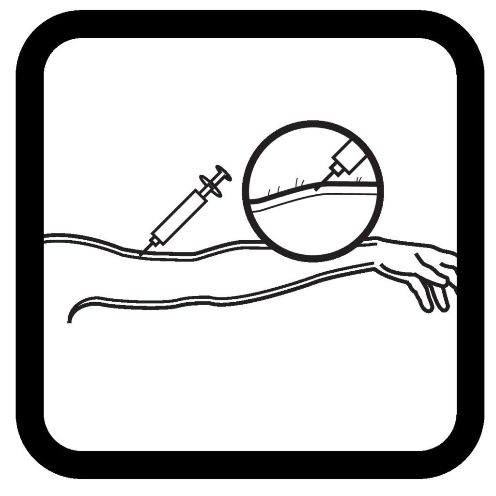
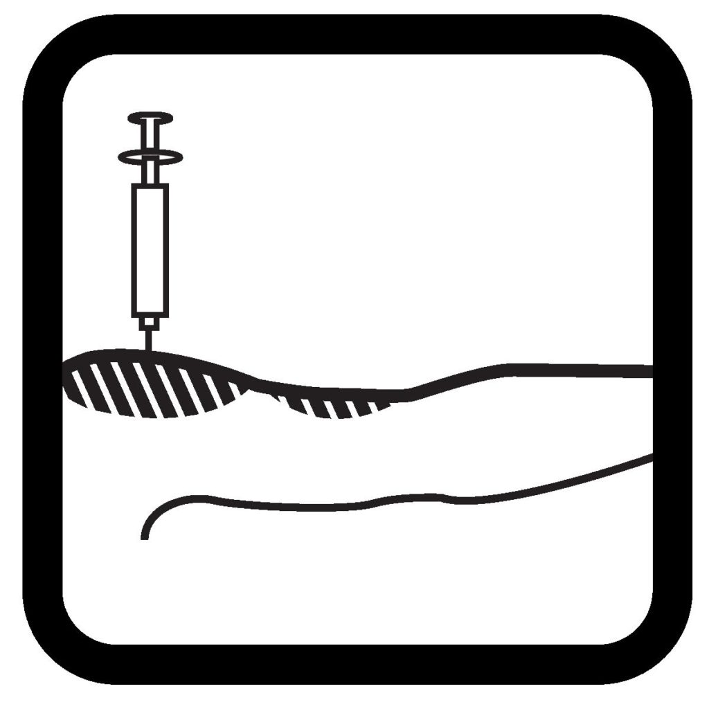
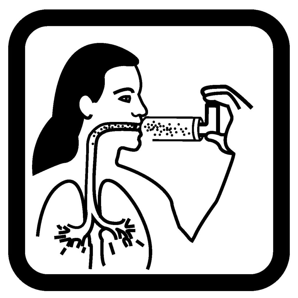
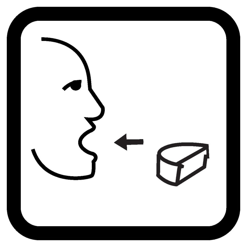
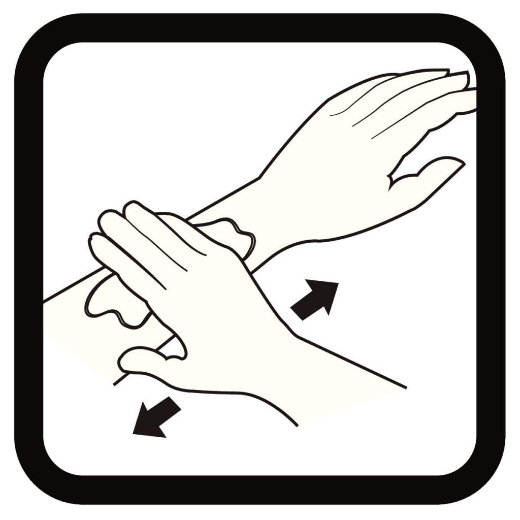
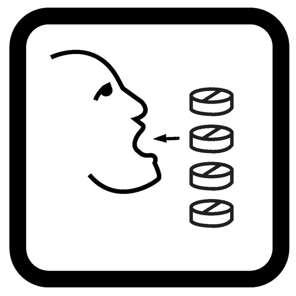
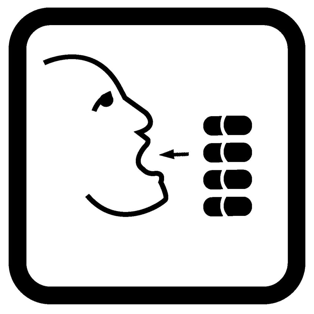
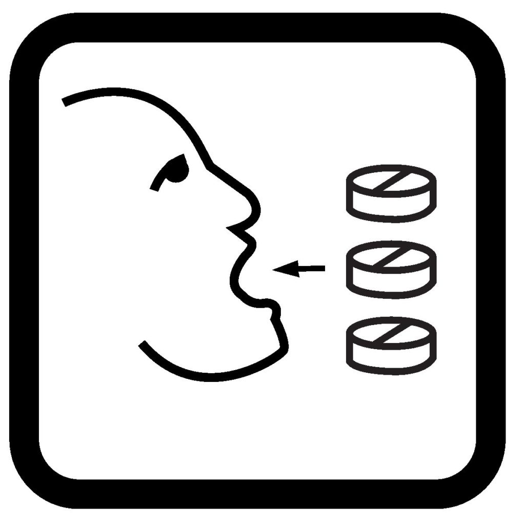
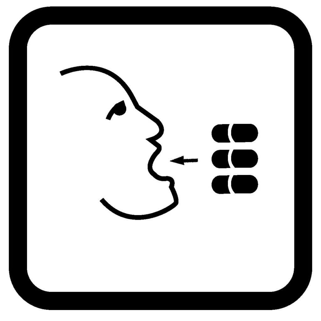
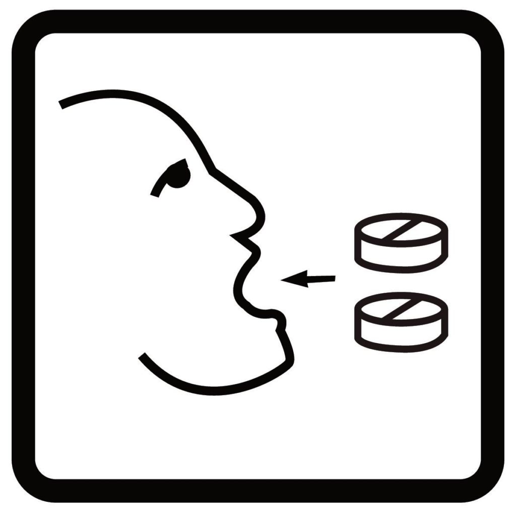
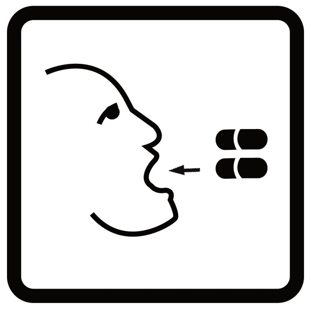
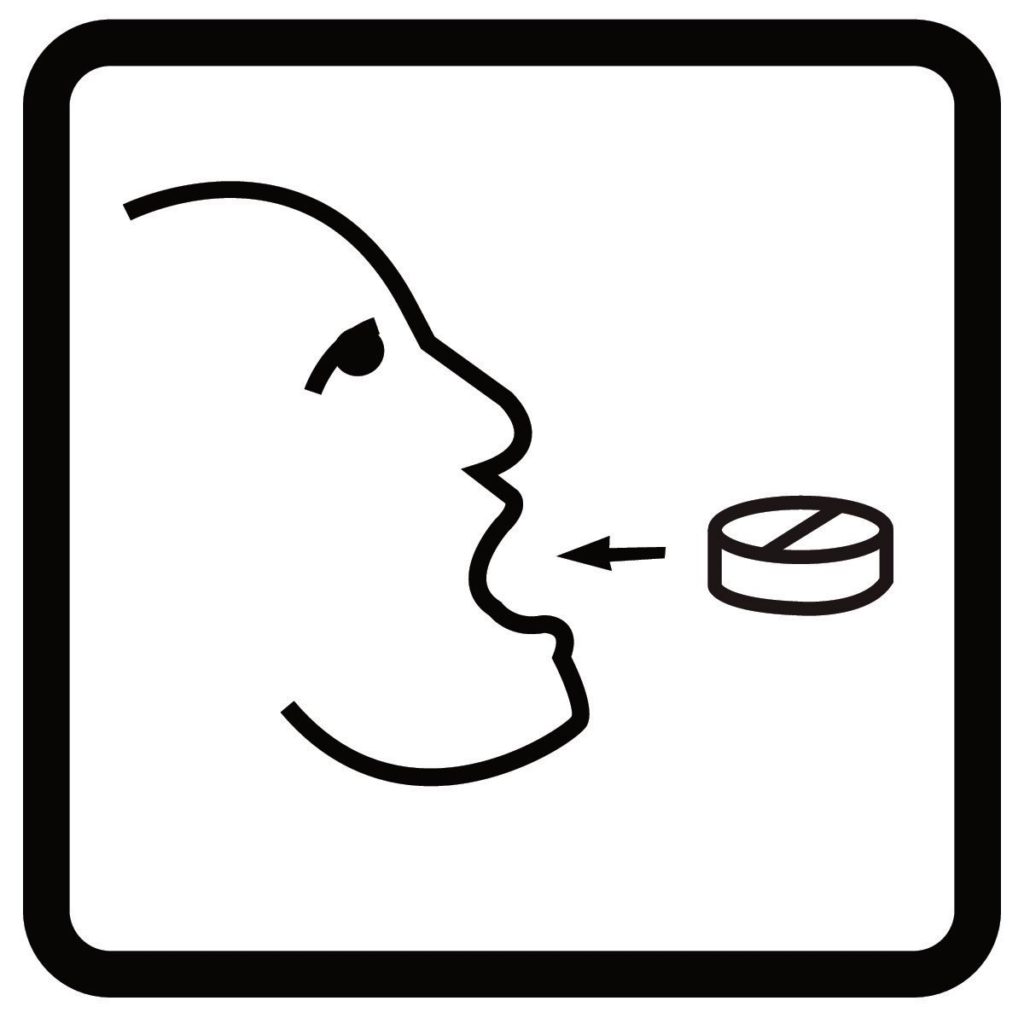
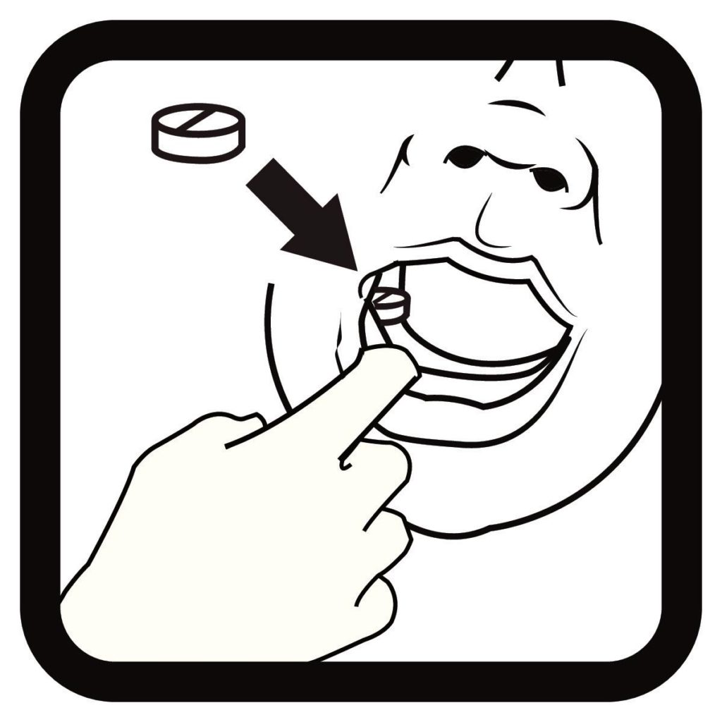
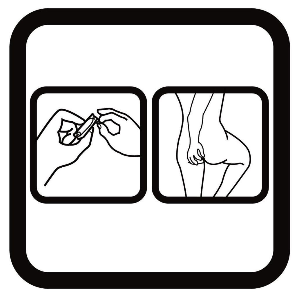
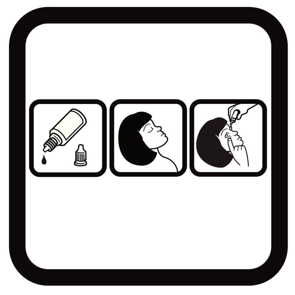
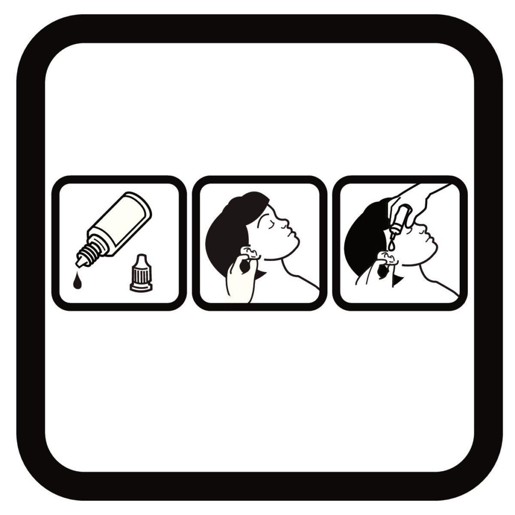
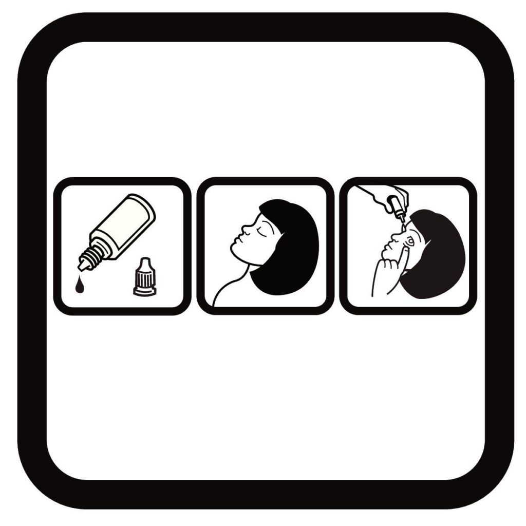
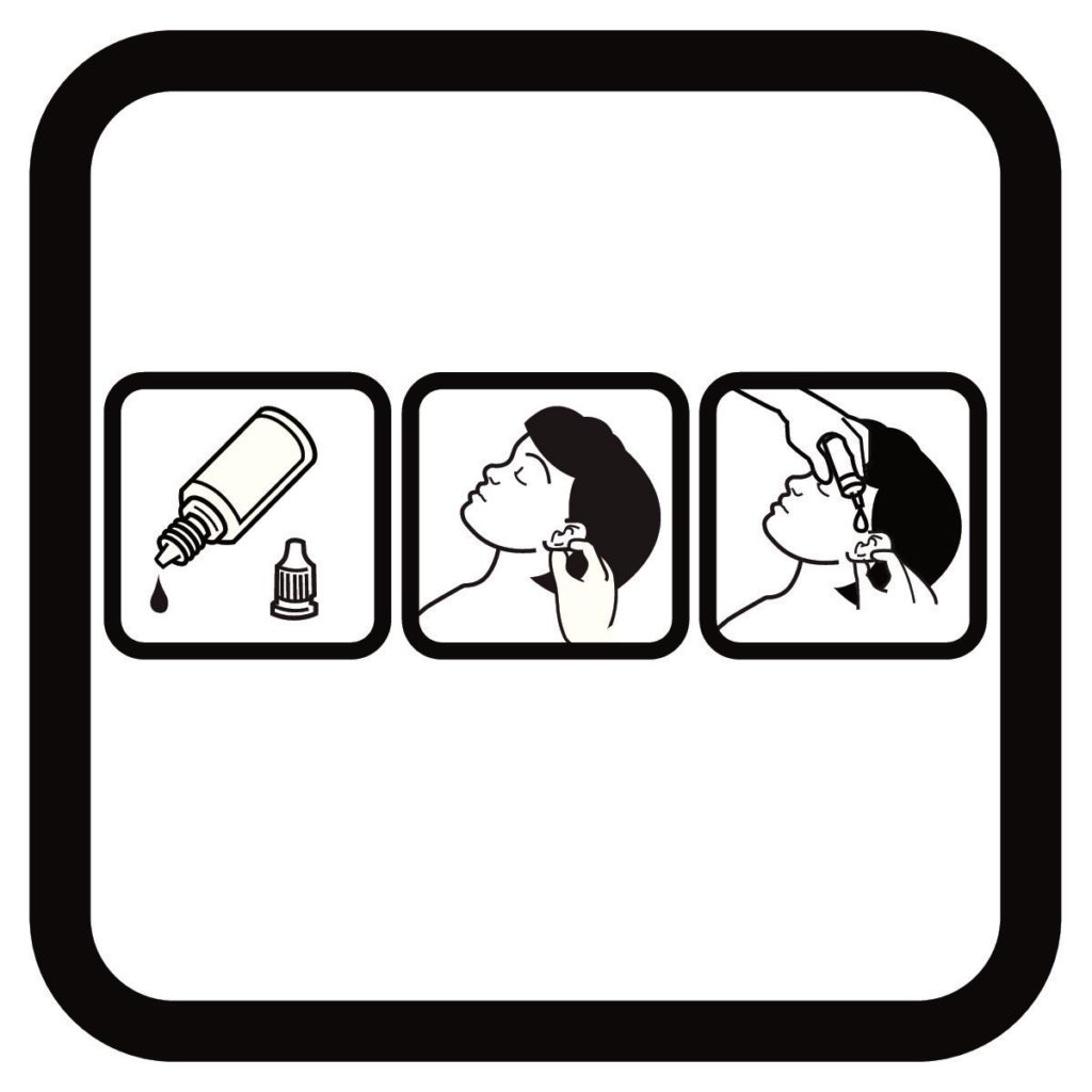
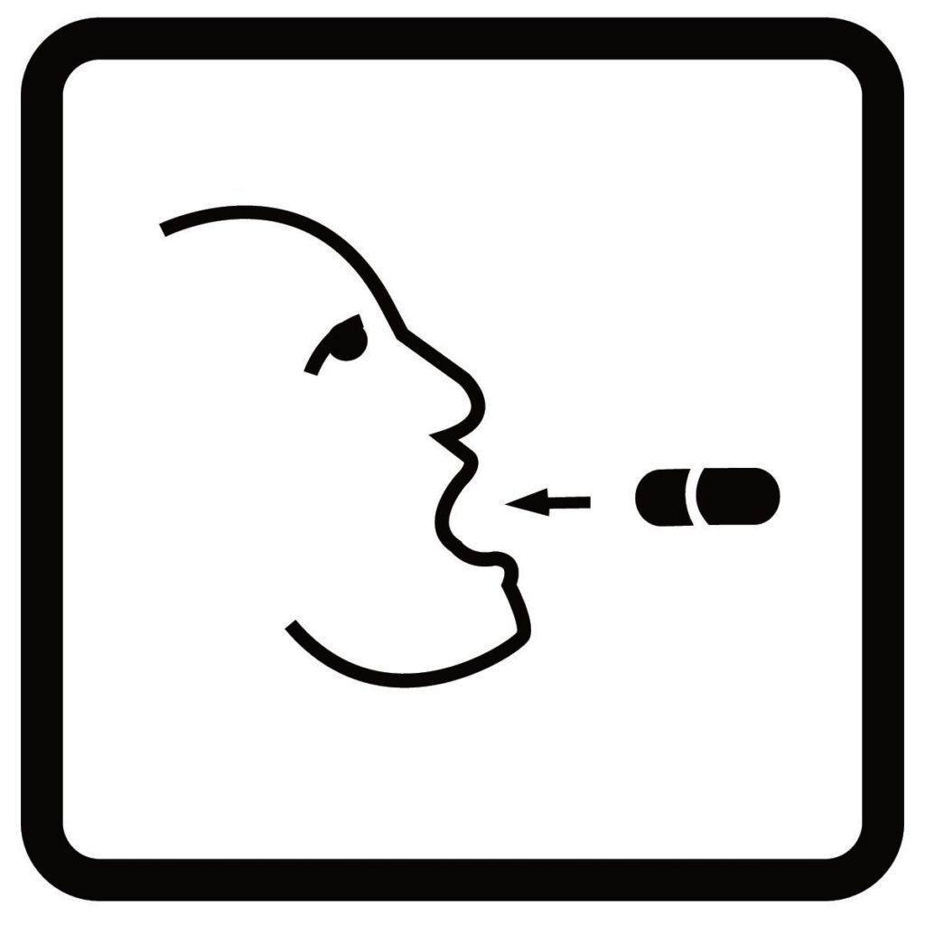
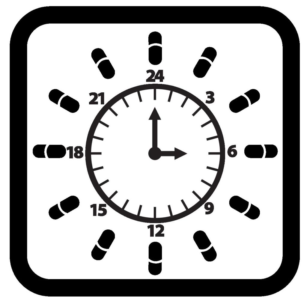
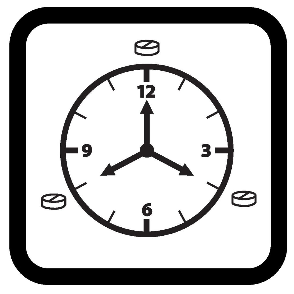
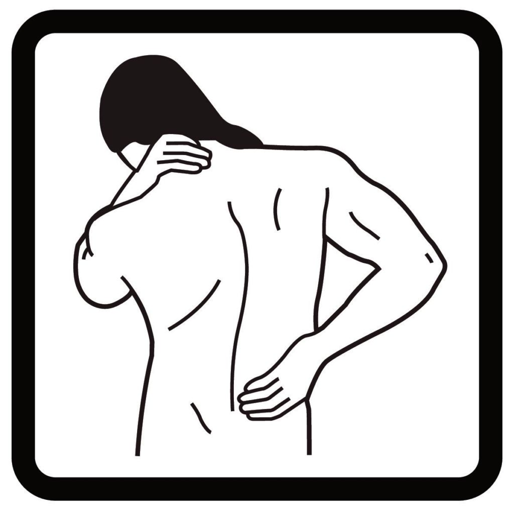
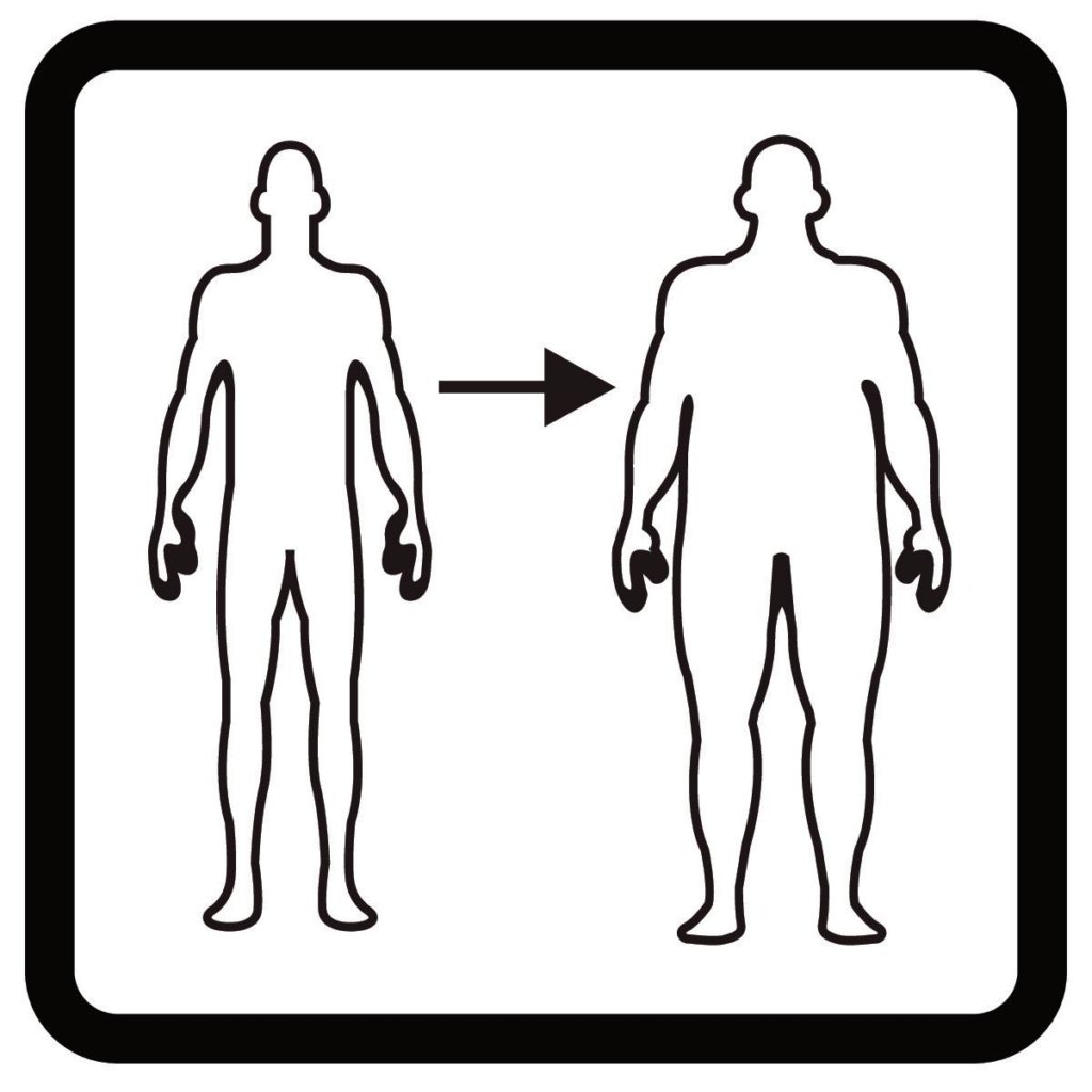
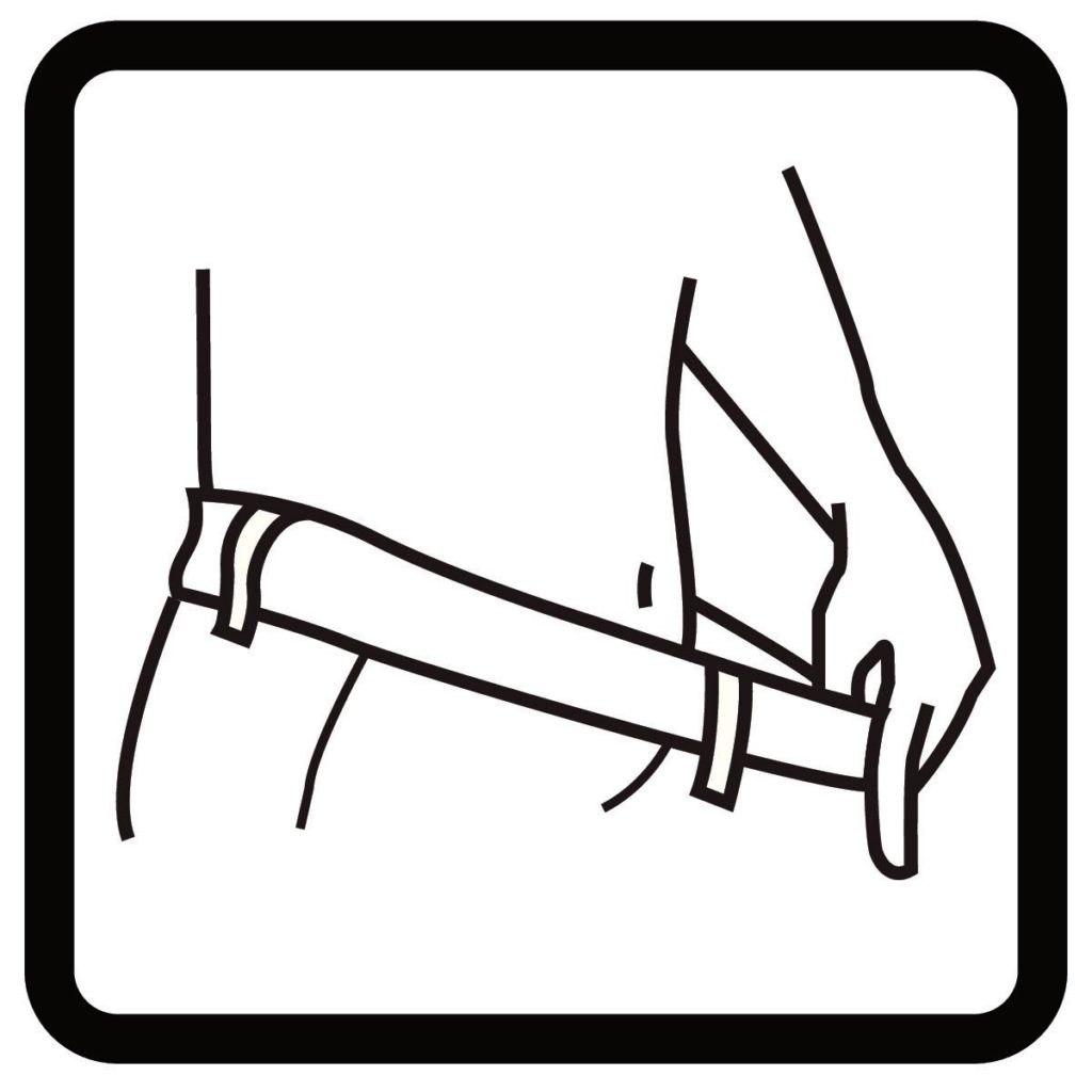
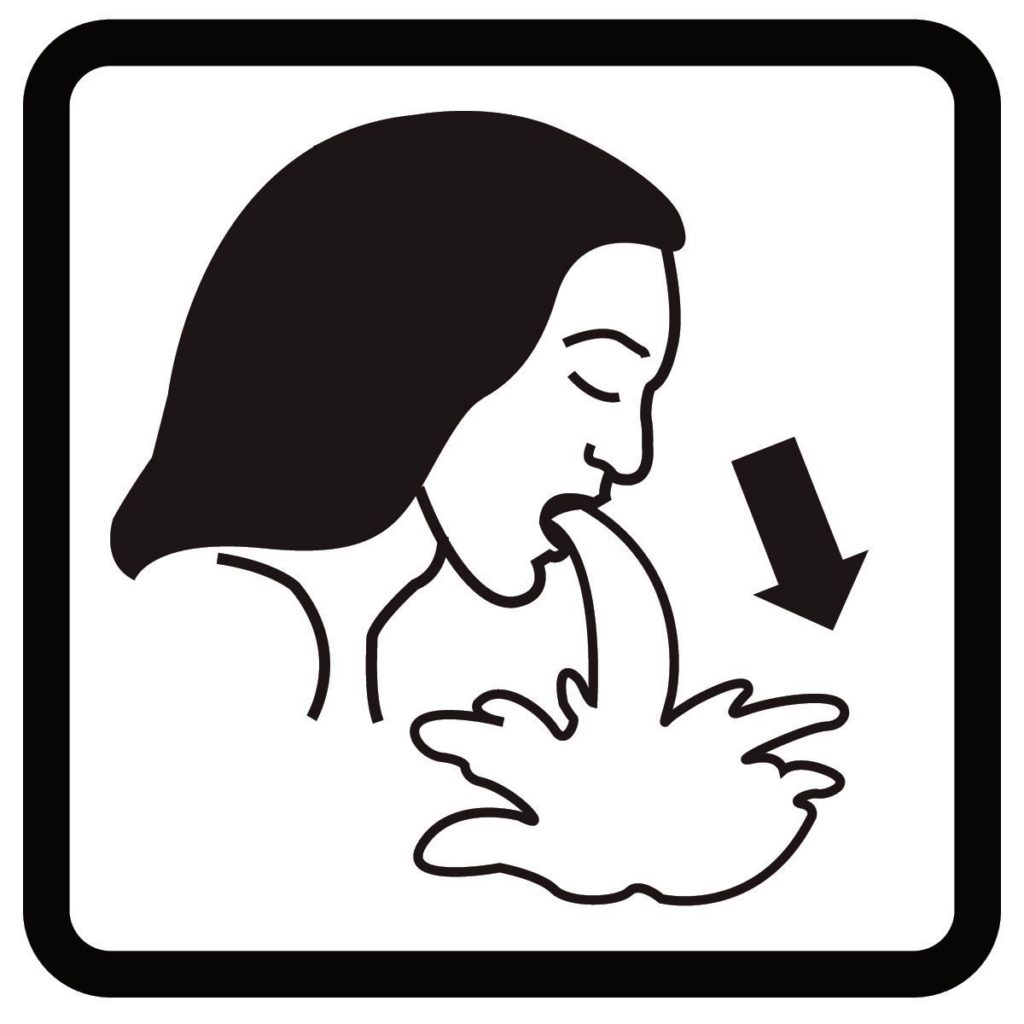
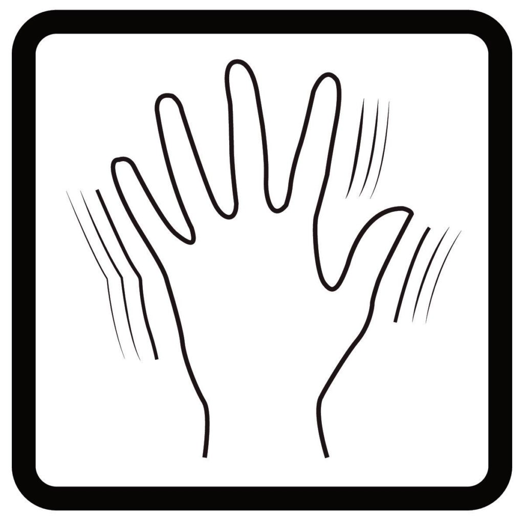
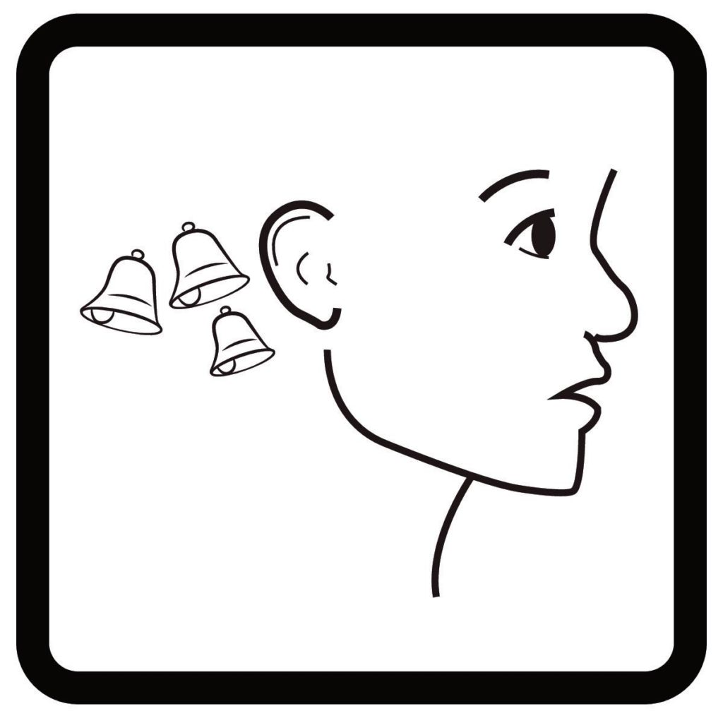
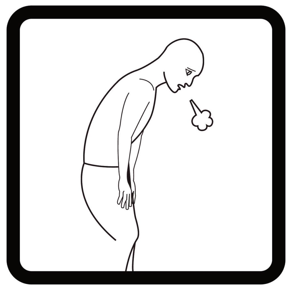
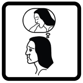
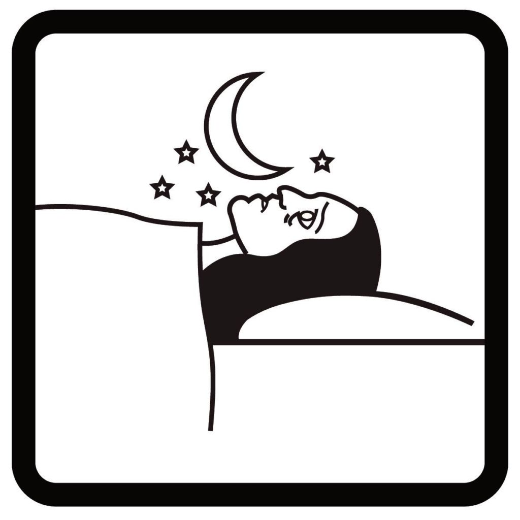
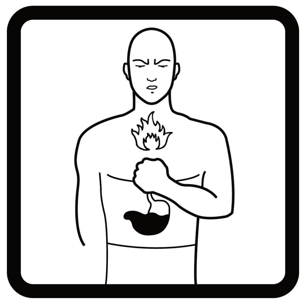
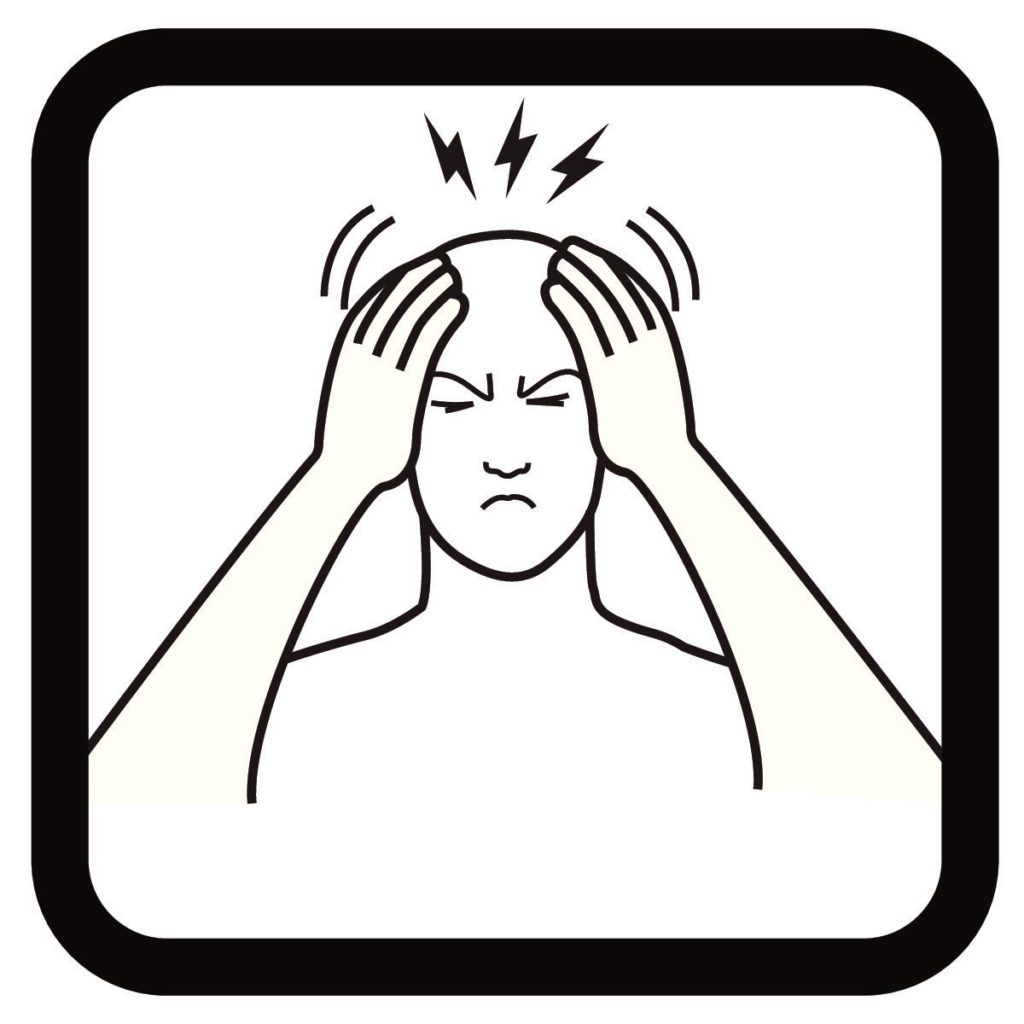
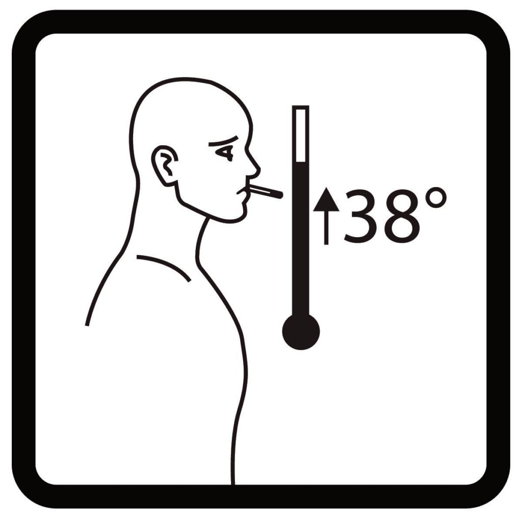
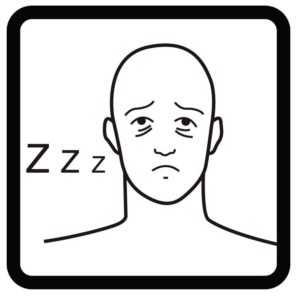
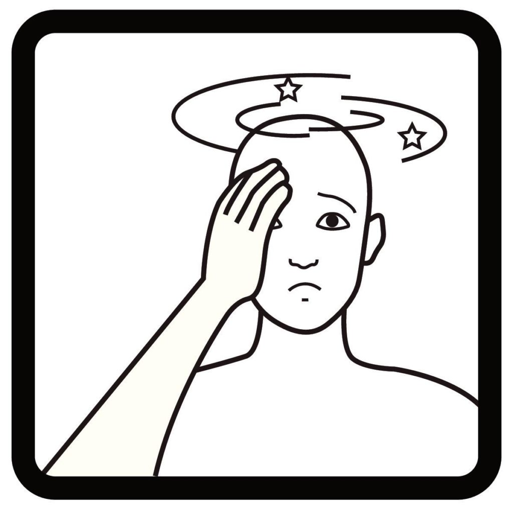
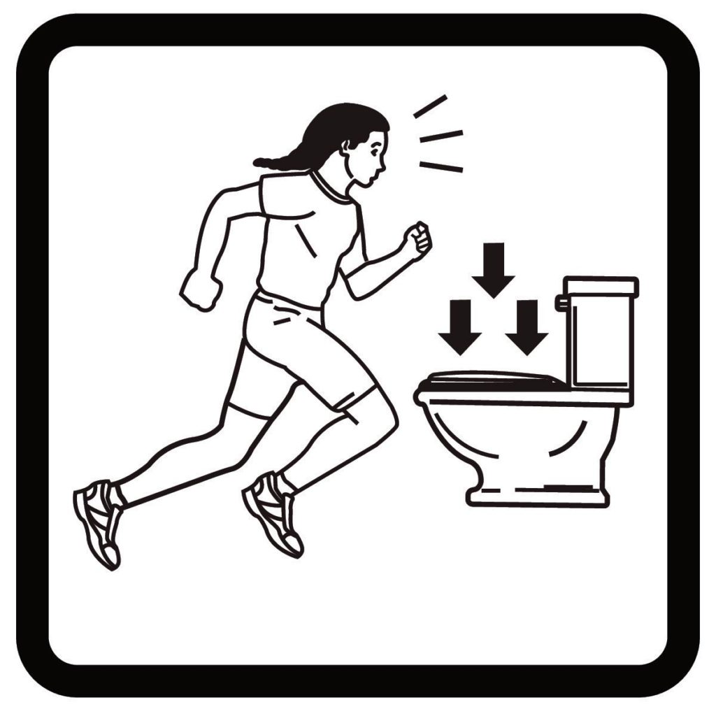
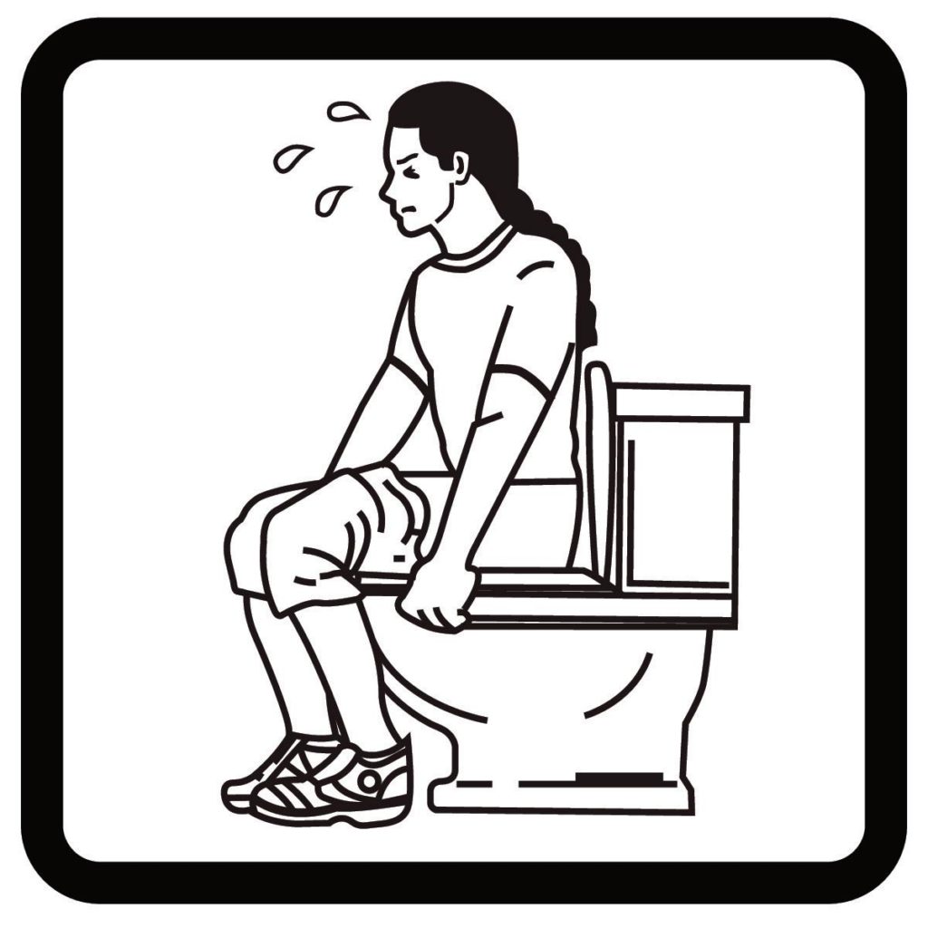
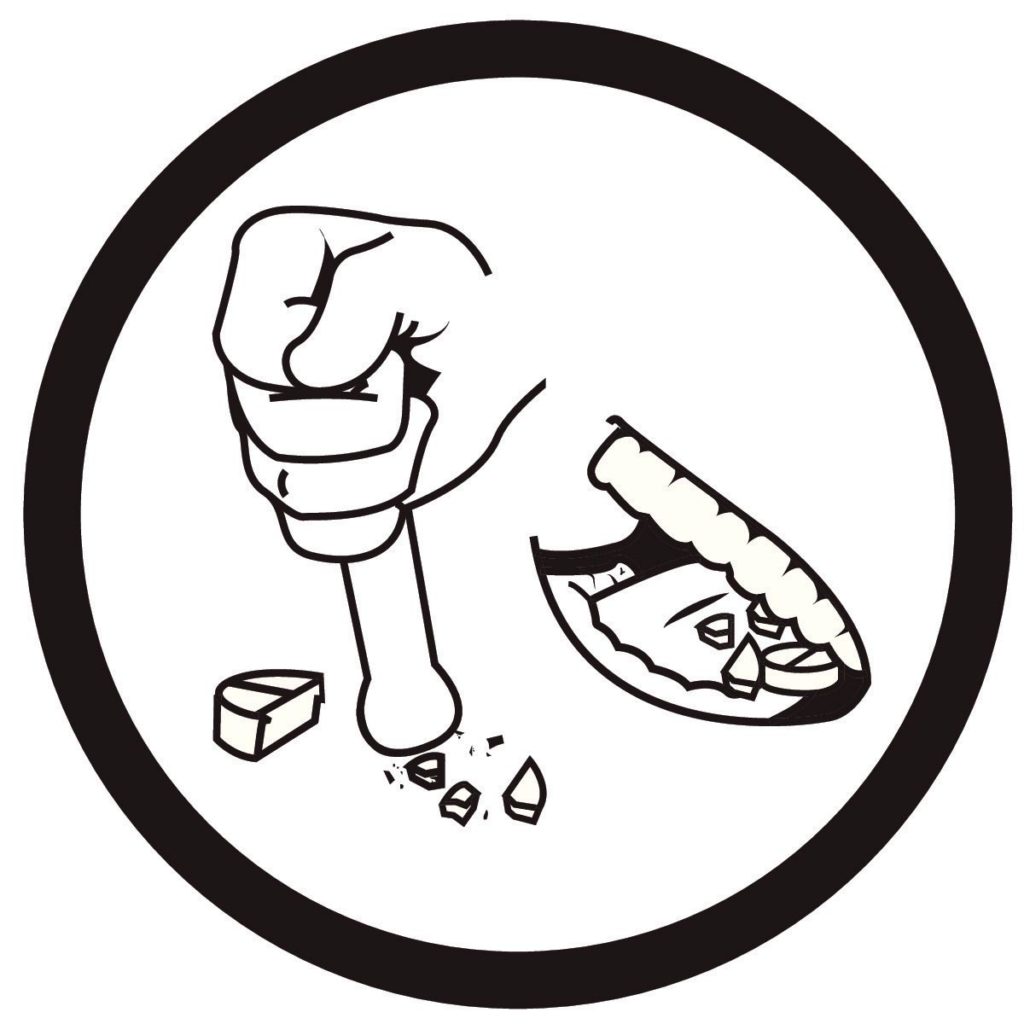
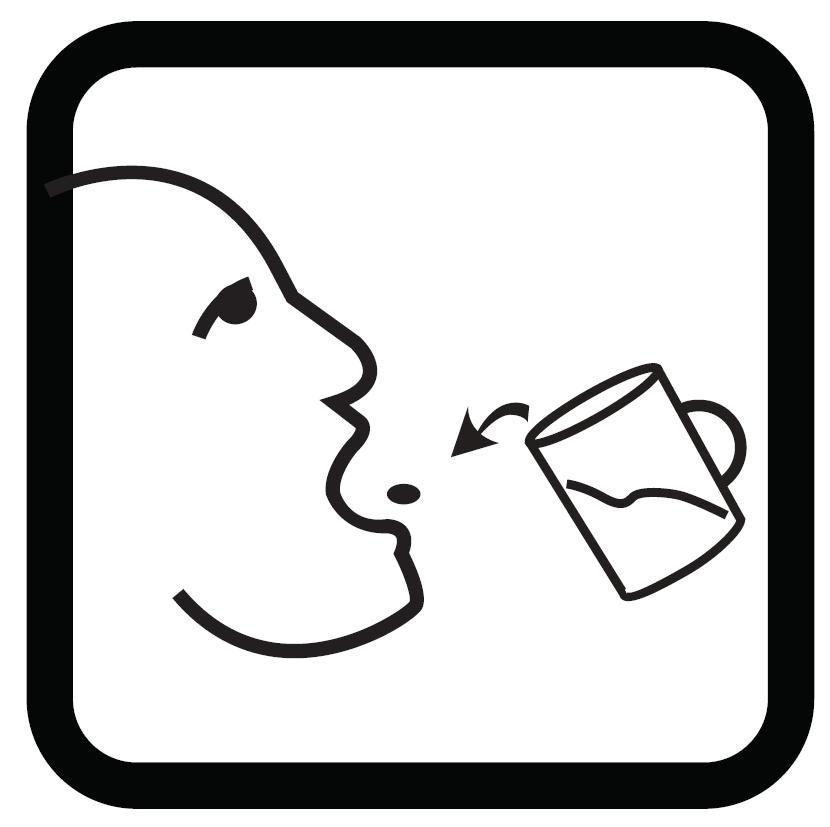
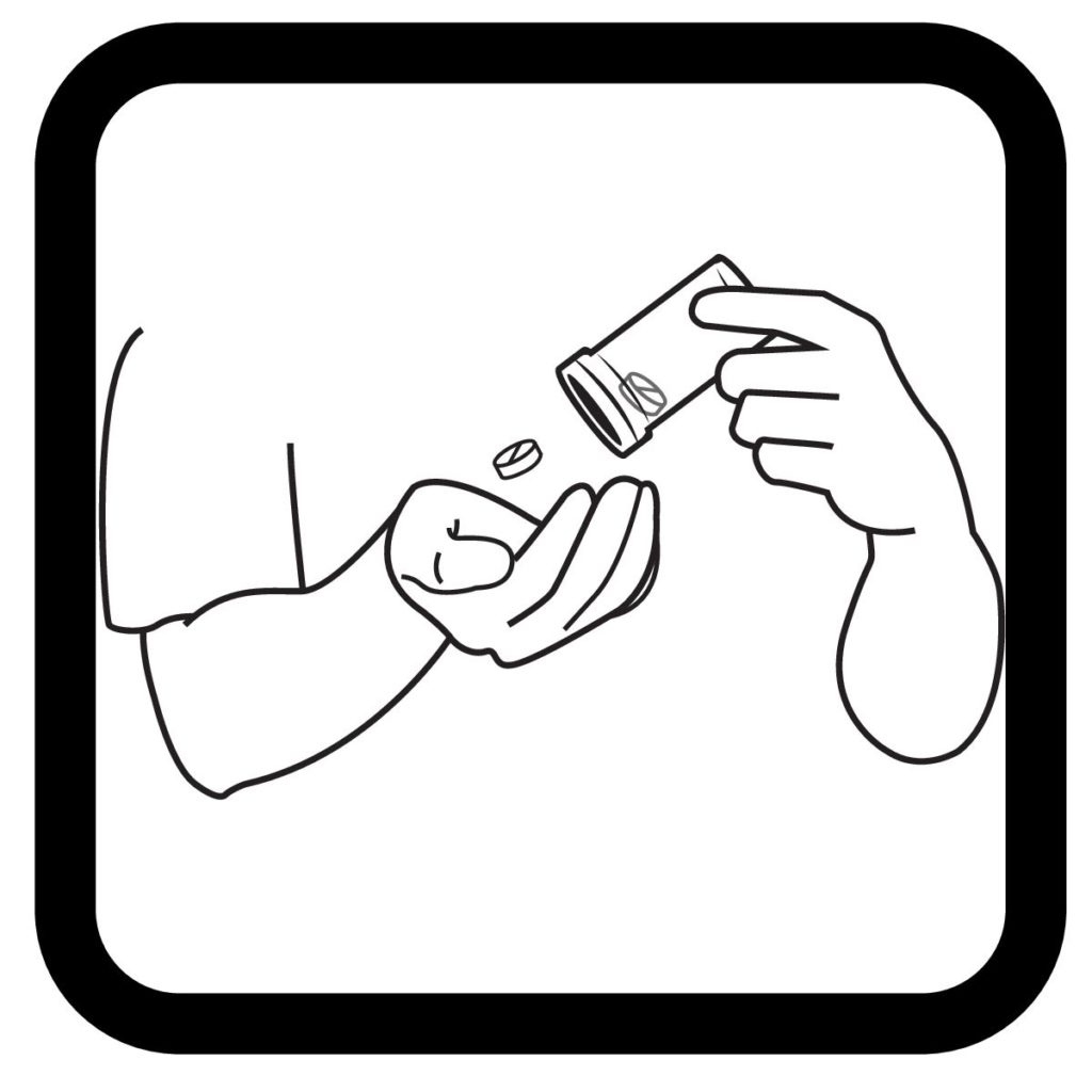
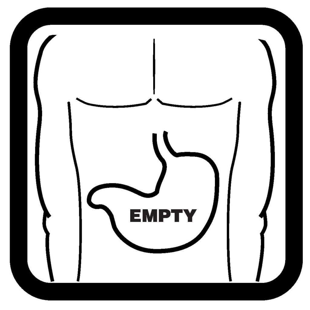
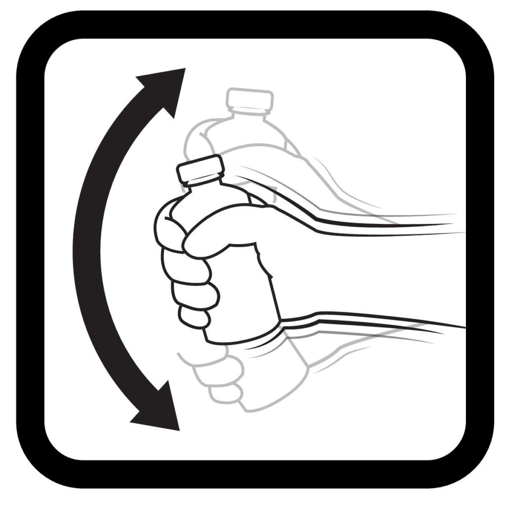
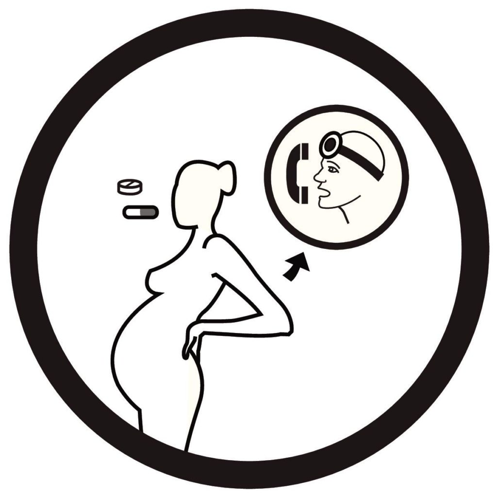
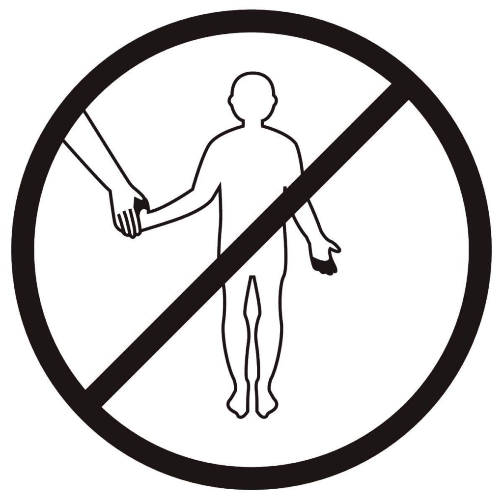
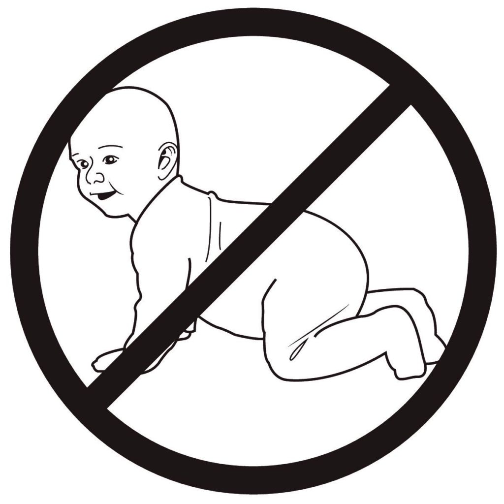
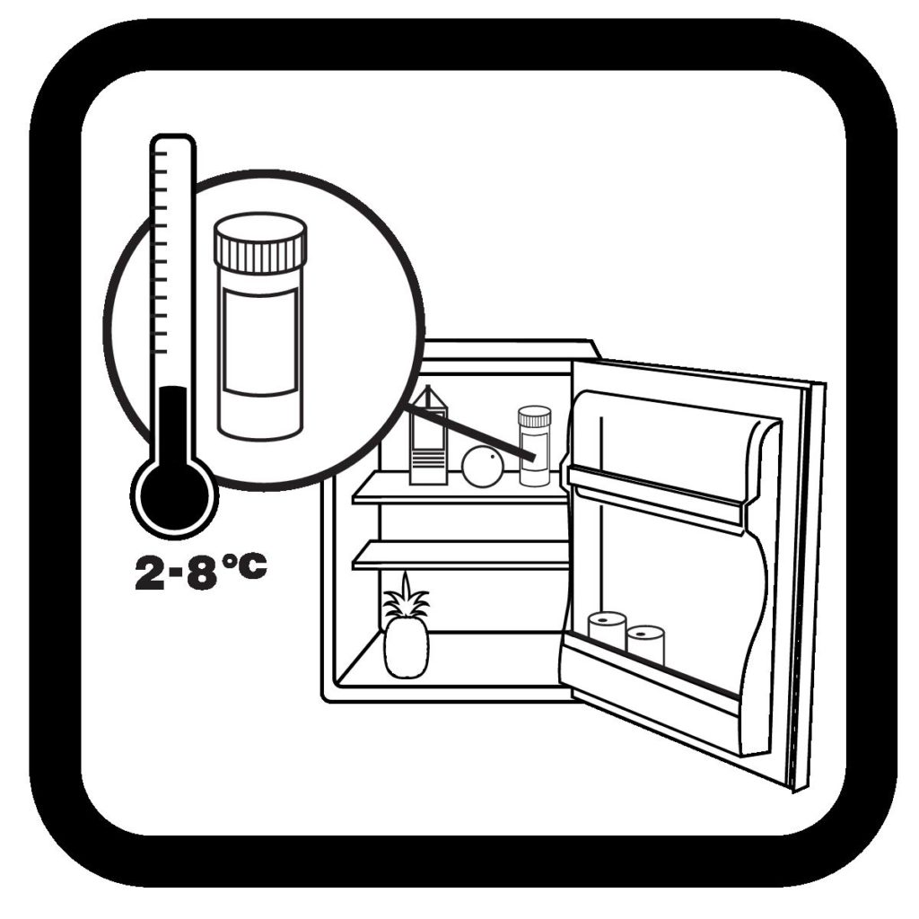
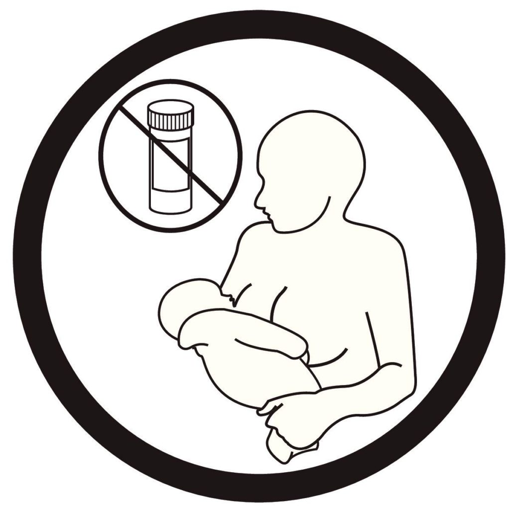
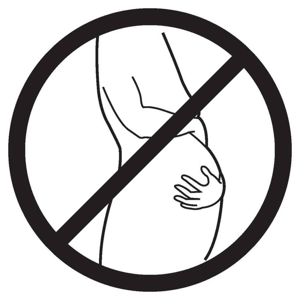
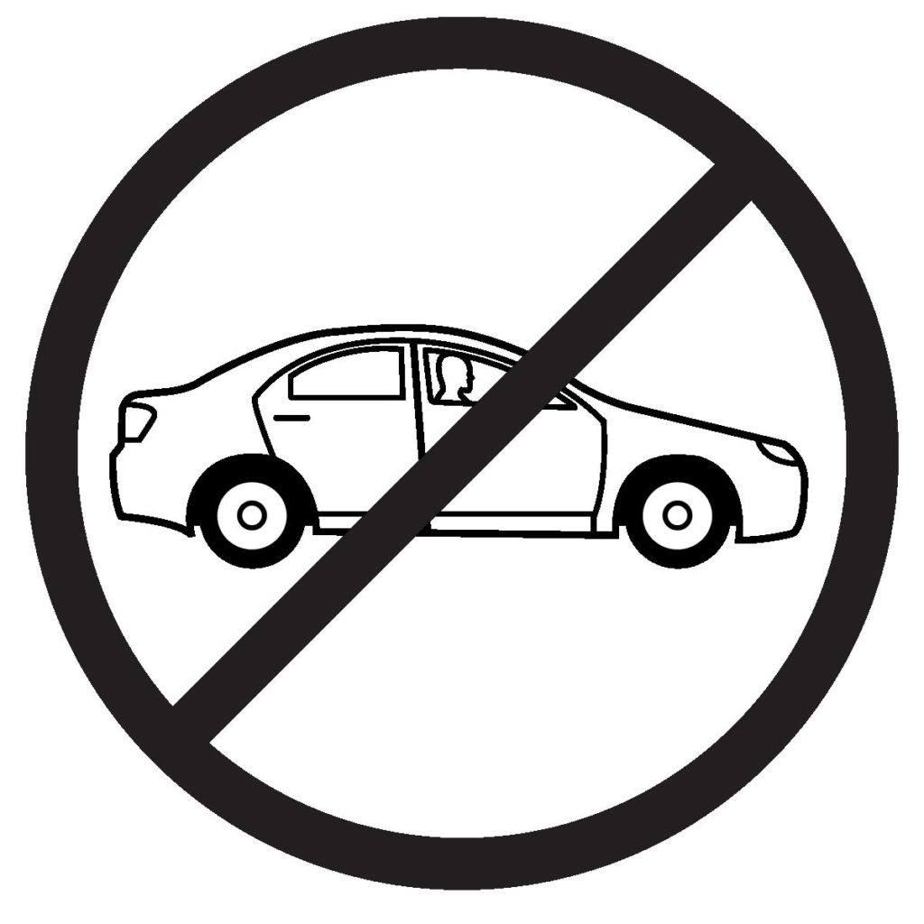
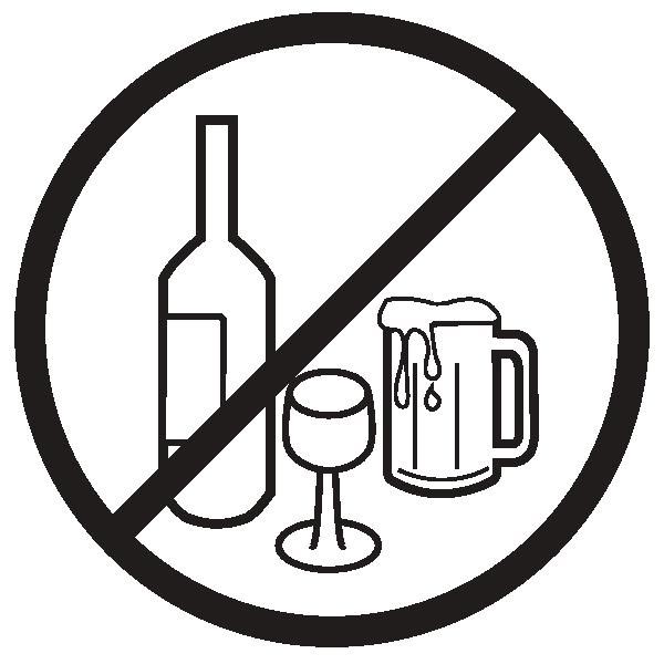
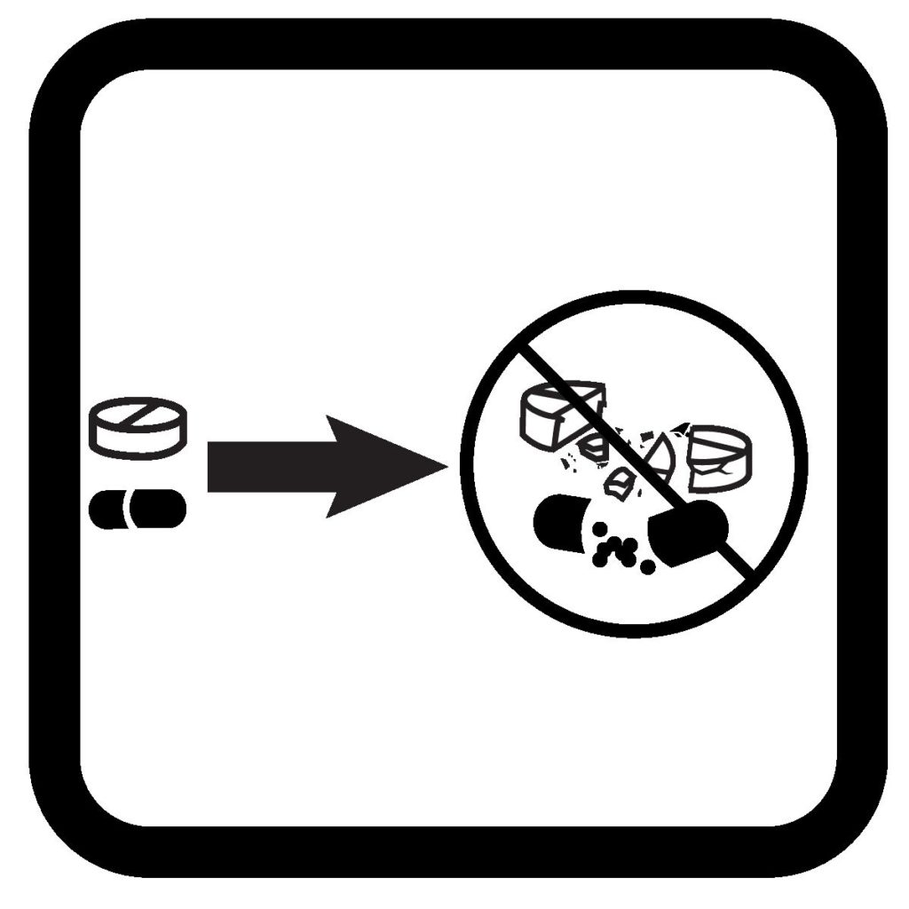
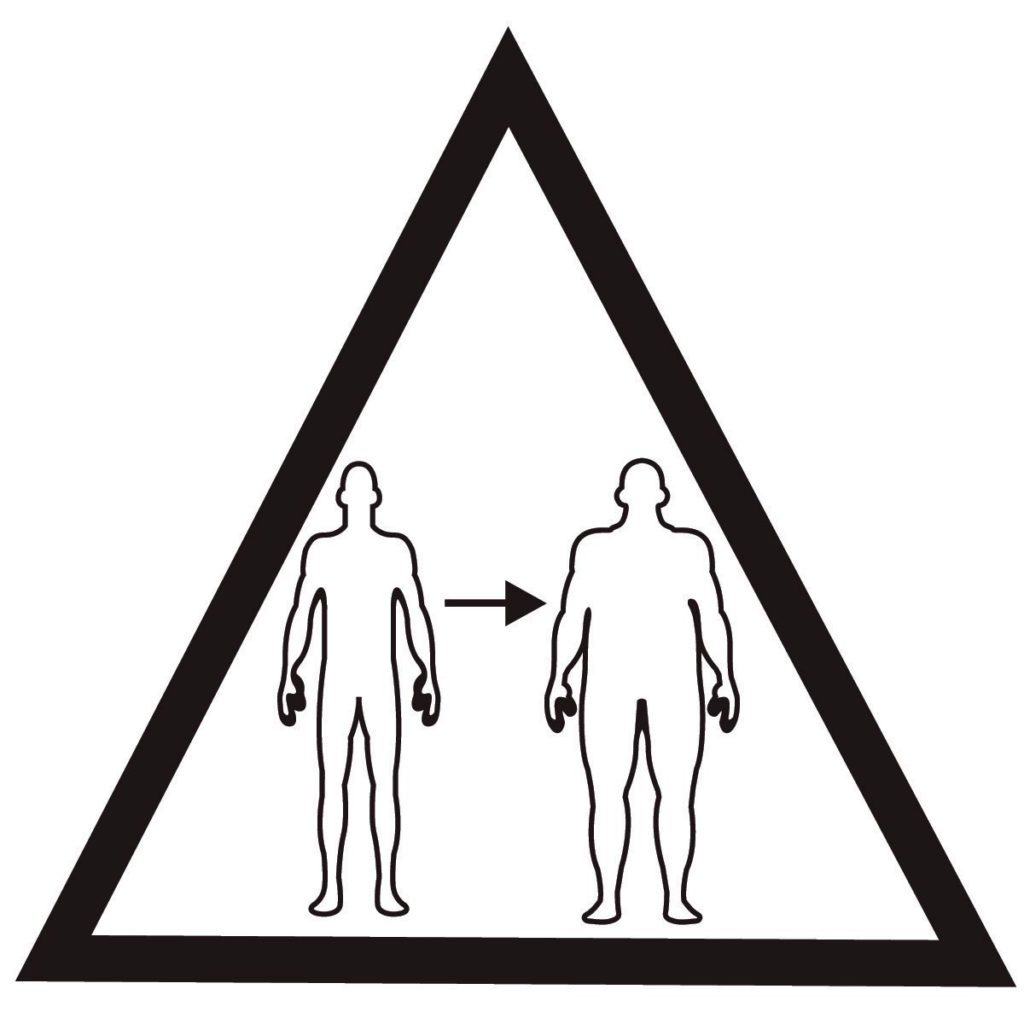
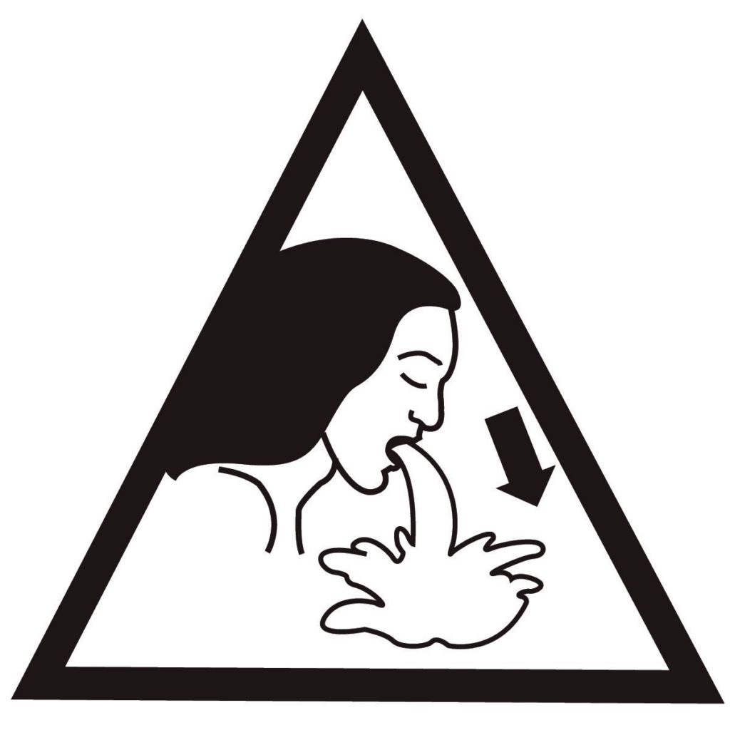
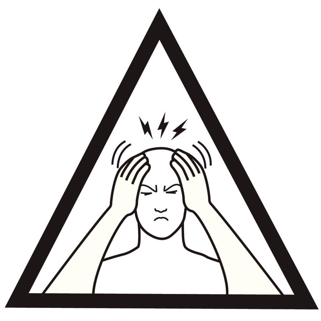
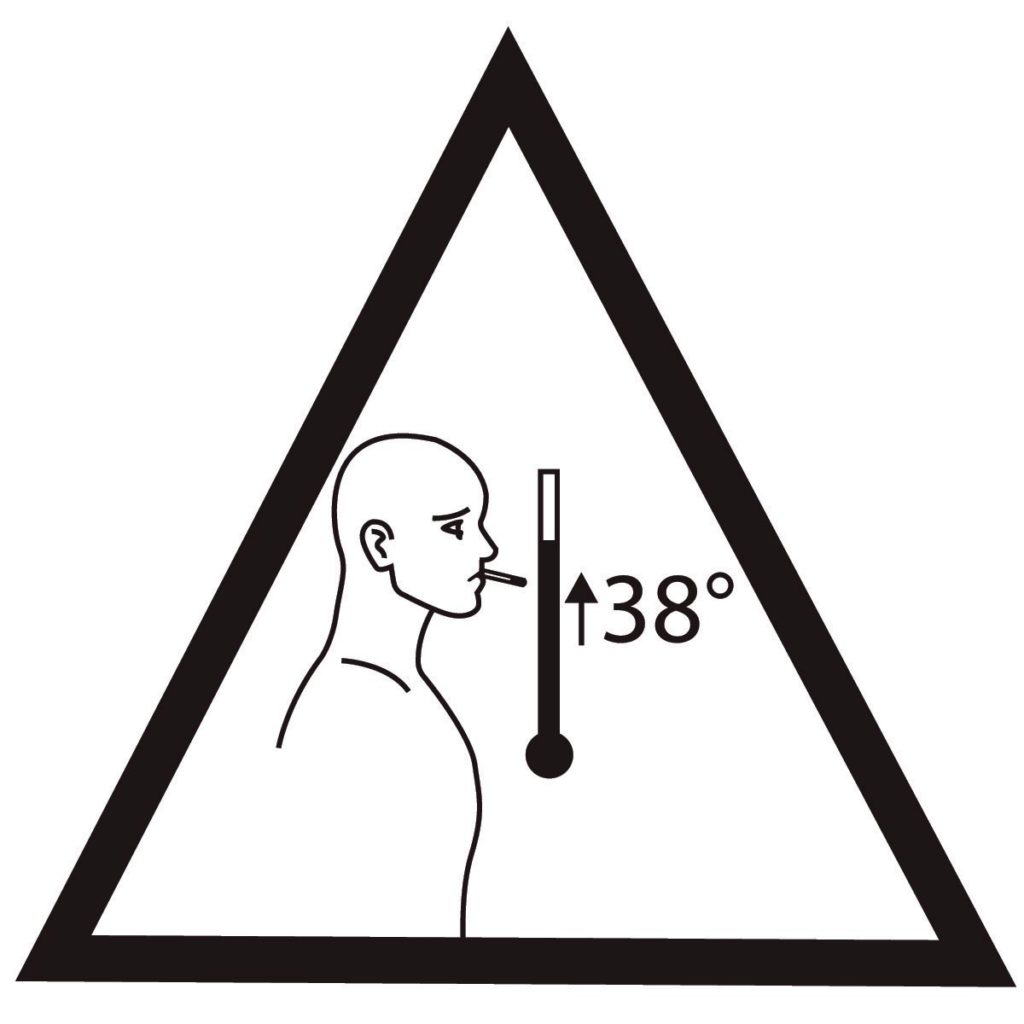
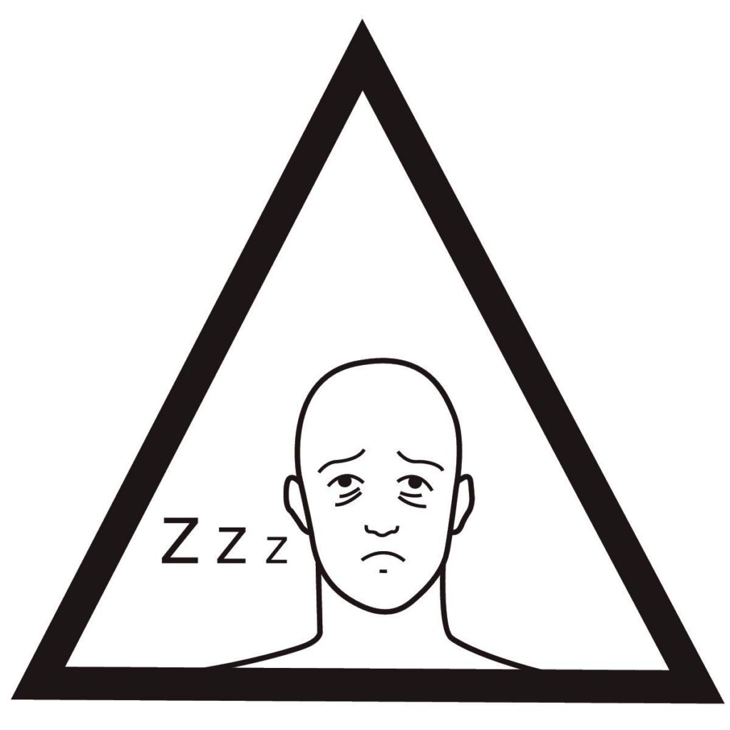
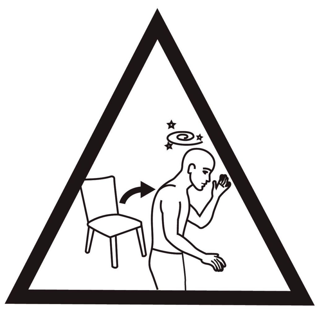
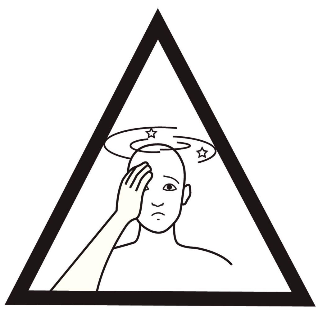
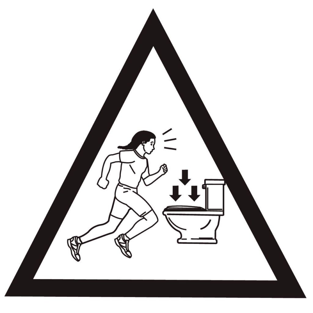
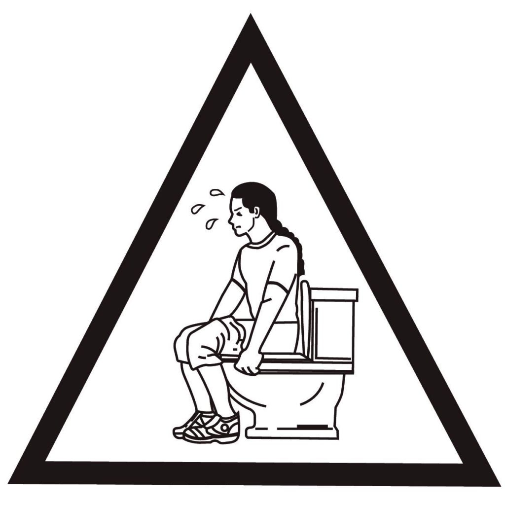
Pictograms are really important to convey information. The pictogram needs to be culturally and patient sensitive and must not be offensive. It needs to be simple to interpret and effective at translating information especially if patients have low education or are intellectually disabled [5,6]. Professor Ros Dowse from Rhodes University highlights the usage of pictograms in her paper "Using pictograms in a patient information leaflet to communicate antiretroviral medicines information to HIV/AIDS patients in rural South Africa" and "Pictograms for conveying medicine instructions: Comprehension in various South African language groups".
Here are some pictograms examples:
Dose and route of administration
Frequency




Indications



Precautions



Side effects








What is a good leaflet?
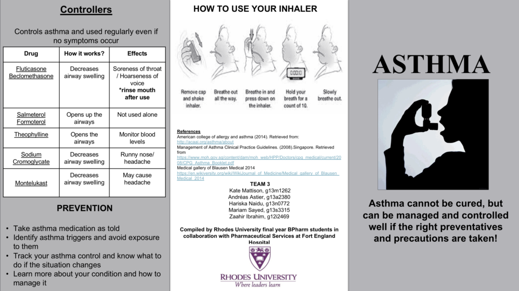
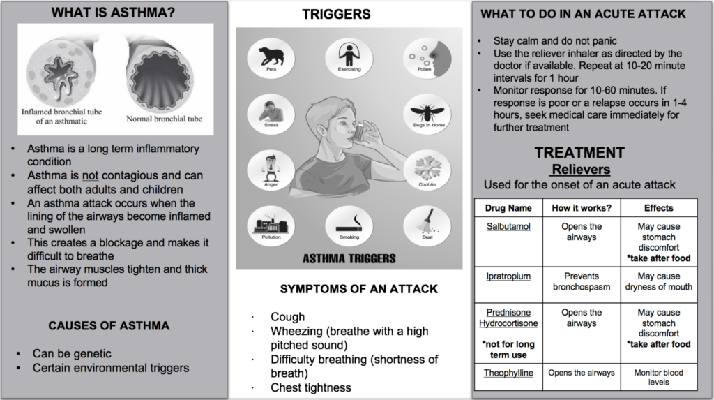
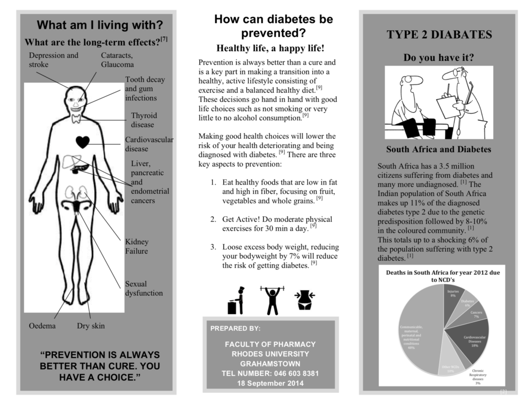
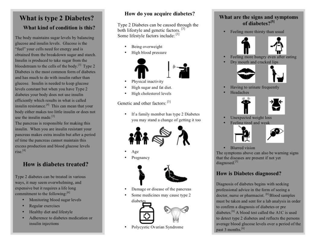
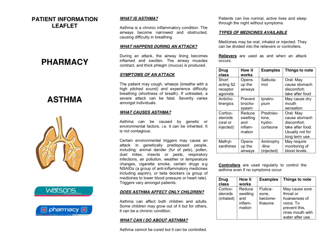
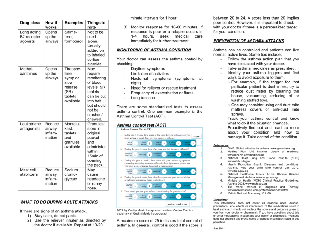
Here are some good examples of a leaflet that creates an appealing picture and demonstrates well the information. There is a good choice of colour with the right choice of pictogram. In these examples, a grey colour was used to save ink and being more environmentally friendly. The readers can easily follow the information that has been given and sections are adequately made. In-text referencing is done appropriately.
My final say
Good luck on making your leaflet!
Do note that leaflets are individualised to its specific disease.
Remember to make a concise leaflet that provides meaningful information and think that if you were the patient what would you like to see? What would help you remember and know more about your condition?
Published 15th November 2018. Last reviewed 30th December 2021.
Reference
1. Rudolf Herber O, Gies V, Schwappach D, Thürmann P, Wilm S. Patient information leaflets: informing or frightening? A focus group study exploring patients’ emotional reactions and subsequent behavior towards package leaflets of commonly prescribed medications in family practices. BMC Fam Pract. 2014;15:163. doi: 10.1186/1471-2296-15-163.
2. American Pharmacists Association. Principle of Practice for Pharmaceutical Care. American Pharmacists Association. https://www.pharmacist.com/principles-practice-pharmaceutical-care. Updated 2018. Accessed October 19, 2018.
3. Raynor DK, Silcock J, Knapp K, Edmondson H. How do patients use medicine information leaflets in the UK? Int J Pharm Pract. 2010. doi. https://doi.org/10.1211/ijpp.15.3.0008.
4. Pharmaceutical Services Negotiating Committee. Practice leaflet requirements. Pharmaceutical Services Negotiating Committee. https://psnc.org.uk/contract-it/essential-service-clinical-governance/practice-leaflet-requirements/. Updated 2018. Accessed October 21, 2018.
5. Dowse r. Using Visuals to Communicate Medicine Information to Patients with Low Literacy. 2004;15:22-25. doi: https://doi.org/10.1177/104515950401500106
6. Dr Nadir Kheir, Dr Ahmed Awaisu, Amina Radoui, Aya Elbadawi, Linda Jean, and Dr Ros Dowse. Pictograms a sound tool for low literacy patients. Qatar University. http://www.qu.edu.qa/newsroom/Qatar-University/Pictograms-a-sound-tool-for-low-literacy-patients. Updated 2018. Accessed October 19, 2018.


