How to Make a Clear, Concise and Appealing Medical Poster.
Introduction
It is always daunting to make a poster that displays a medication, a certain disease or a scientific paper. In this blog, I will be giving tips on what to do to get a clear, concise and well-articulated medical poster. These tips can be used outside of medicine as the same ideas can be used for pharmacy, nursing, physiotherapist and many more!
Making a poster is demanding. It tests your friendship, your patience and how well you get along within a group which is important especially in a health profession. I had my few shares of bad and good groups, ranging from disagreeing completely to a successful poster.
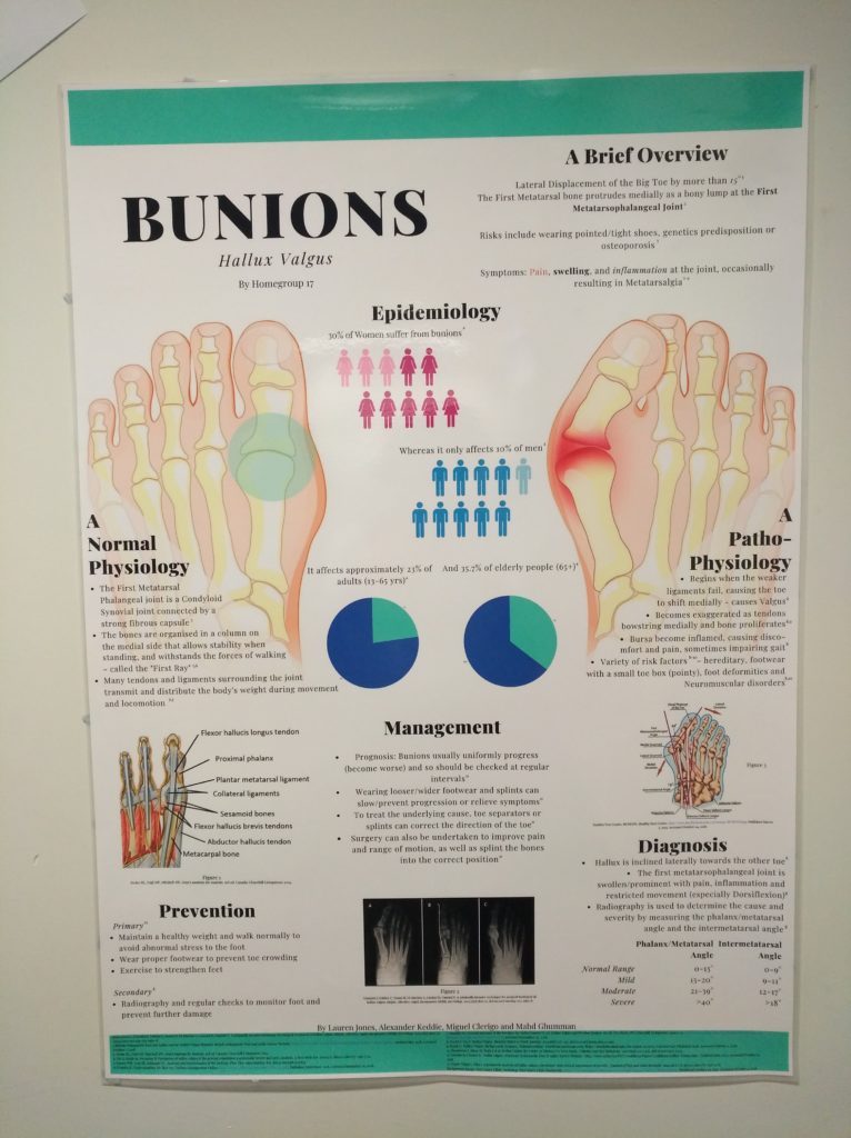
In this example, the poster will be orientated towards a disease, in our case, we had bunions and will explain about its normal physiology, pathophysiology, symptoms, risk factors, prevention and treatment with all the references.
Where would you start, and how?
First things first:
Do you have a topic?
Do you know how many team members are going to be present?
What is the due date?
Who is the poster for? - this is very important in terms of pictures that have been chosen and language used.
Make a social media group. That can be anything (Facebook, Whatsapp, Messenger, Line and others) so that anything can be discussed immediately and everyone is in contact. Also, make a google document and possibly a Dropbox so that the document can be easily shared.
Some do their poster on PowerPoint as you can change the ratio easily or alternatively Photoshop works really good.
If you really want that design feel and look, I highly recommend Canva (it is free!) and Adobe Illustrator.
This YouTube video created by Tamara Swedberg called "Research Posters" teaches how to create a poster using PowerPoint. Click here or simply click the picture.
Research Posters by Tamara Swedberg. Published on the 18 July 2014.
Learn how to create stunning research posters using PowerPoint.
A quick exercise you can do to start
Get a piece of paper and jot down these ideas:
Google some posters and review font images and choices of colour. What colours shall you use?
Write down agreed choices as well as relevant web links for later use. Very important for referencing!
Write down a brief overview of the disorder (definition, epidemiology, symptoms, risk factors, aetiology and prevention).
Write down a brief overview of the normal structure and function (relevant, accurate, concise details of relevant normal anatomy / physiology / biochemistry).
Write down a brief relevant, accurate, and concise description of the pathophysiology.
Draw the organisation and flow of all content in a diagram to attempt to make it self-explanatory.
Discussion of a management plan to have the poster completed a week early ready for printing, this can include ‘team roles’ of researcher/s, creator/s, printer/s, etc.
What level of participation do you require from each group member?
The first steps towards your poster
Discuss the topic and poster content as a group.
Make a literature review of the chosen topic.
Get the title right.
Graphs and pictures tell the story. Remember to be culturally sensitive when using a pictogram or people in a poster.
Consider the size requirement for your design and what you can include.
Don’t forget a reference list.
Don’t forget to add your names and/or group name or number.
Discuss a management plan to have the poster completed a week early ready for printing.
When working on the poster be careful with quality. If you start on a smaller scale you will lose quality by scaling your poster up. Photoshop can scale up your poster without losing quality by increasing pixels per inch (ppi) or dots per inch (dpi). Usually set to 300 ppi and your allocated size.
Making sure all objectives are met, that is where the marks come from.
What is a bad poster?
Here are some examples of posters that do not create an appealing picture and does not demonstrate well the information as some have too much information. These posters may be confusing and difficult to interpret the information:
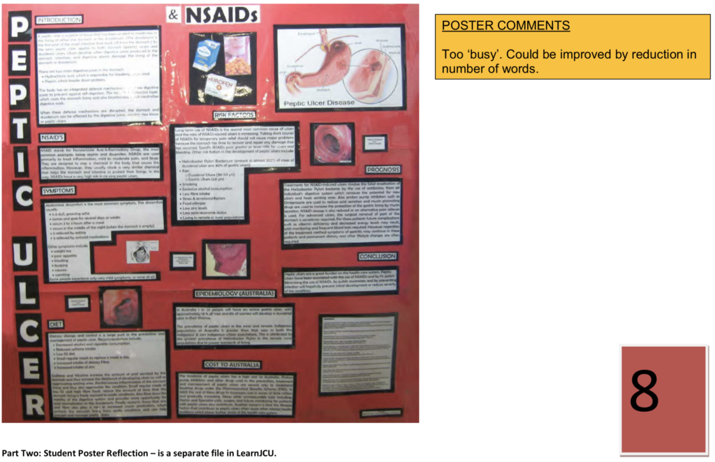
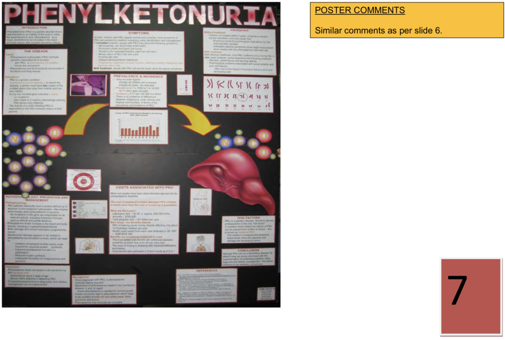
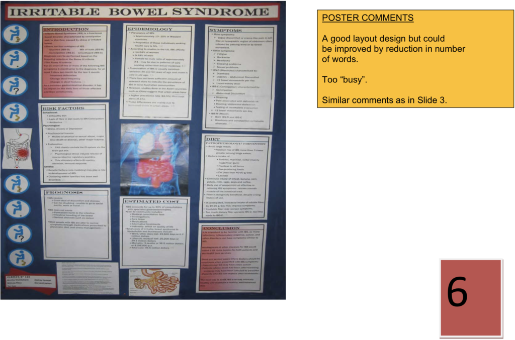
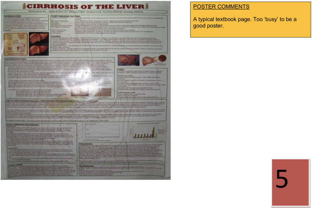
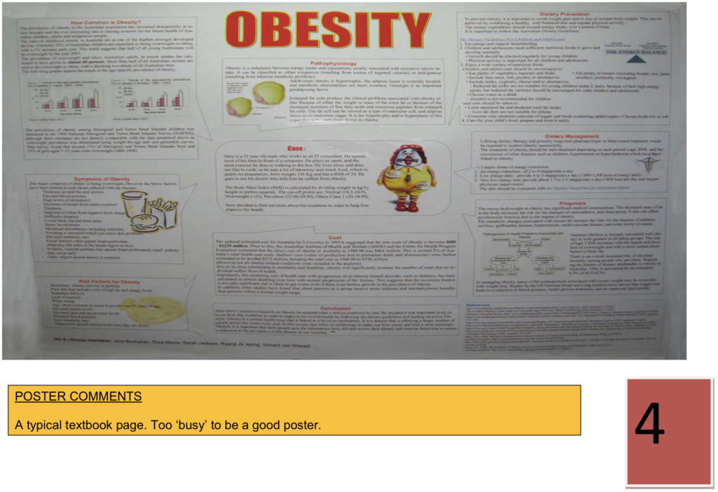
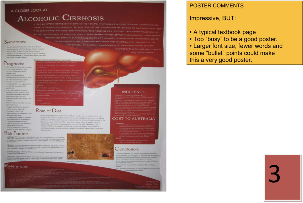
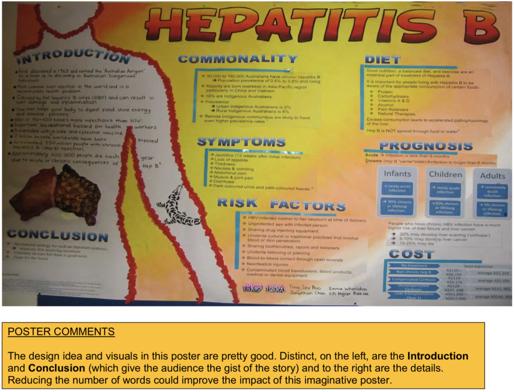
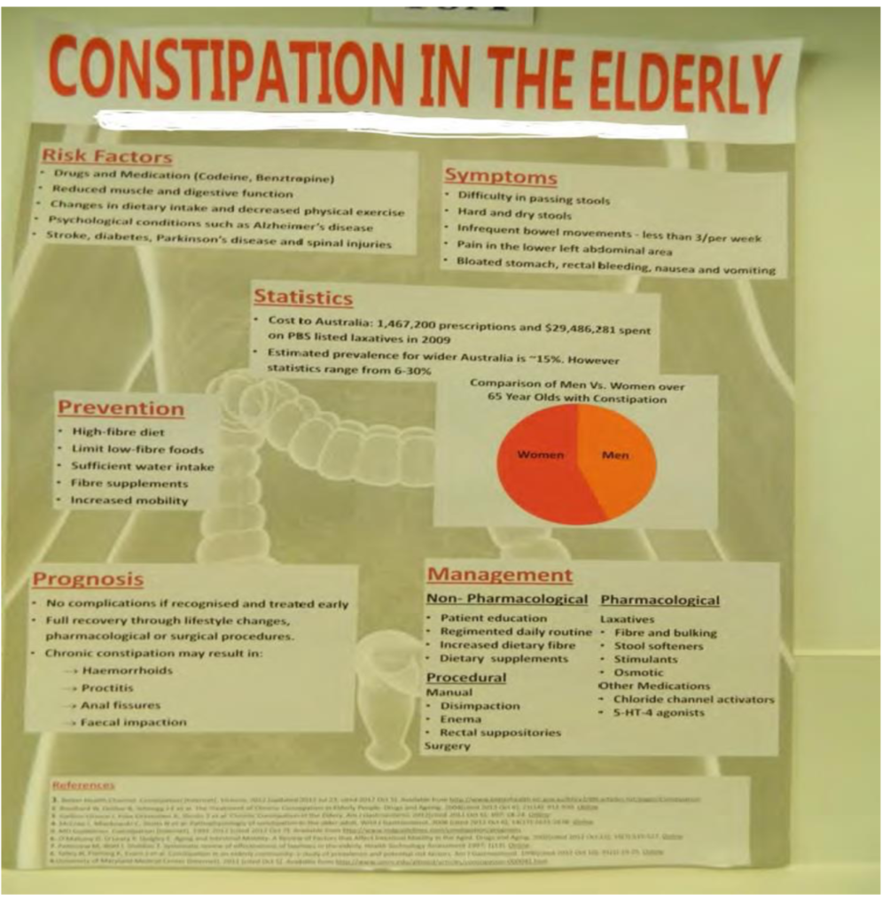
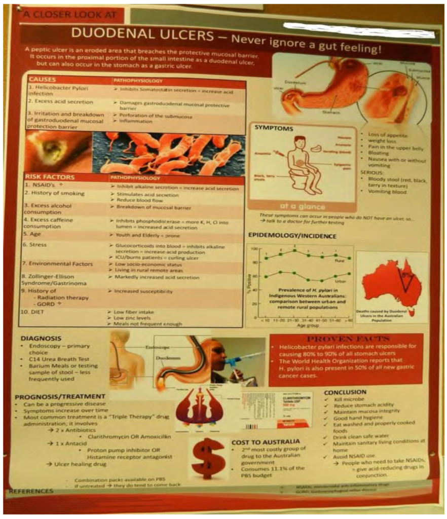
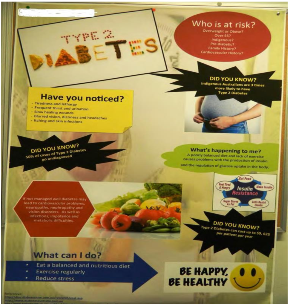
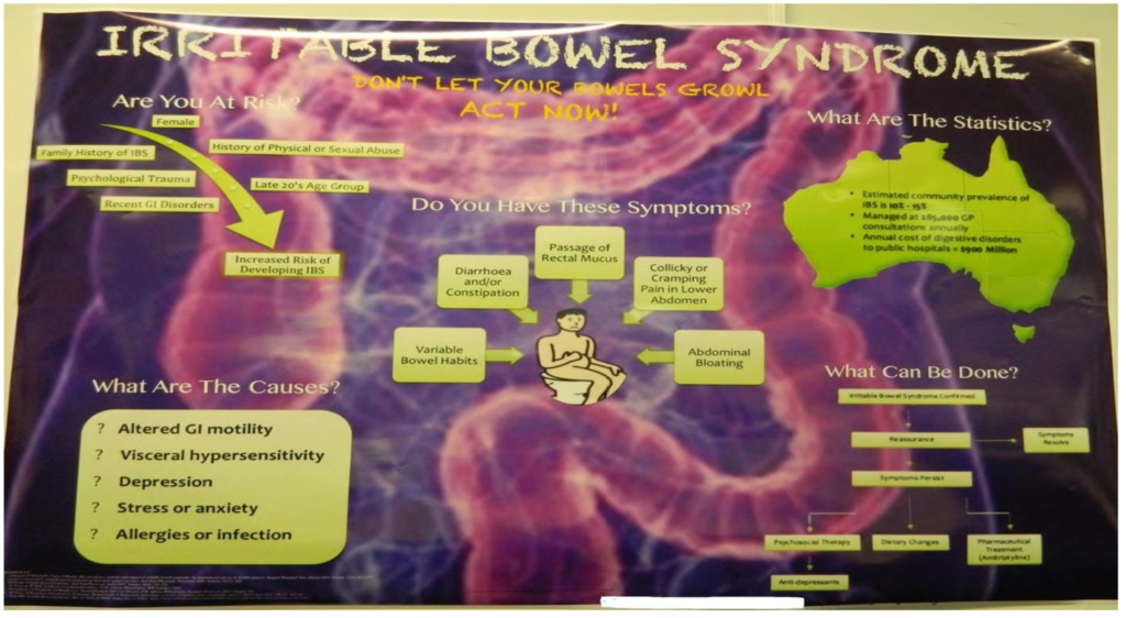
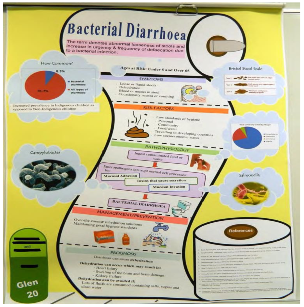
Although some posters are interesting and entertaining, it is generally based on your audience. If your audience is for kids, then bright colours and simple words are best. If it is for patients, then use simple and concise words with more thorough information. This must include medical terms that are explained easily. Posters for patients can be more professional, ordered concisely and neat, with a good choice of colour. Remember that some patients or other people would not know anything about a certain disease. Ask yourself - what would you like to know if you or someone you know has a certain disease?
Criteria for a good poster
Size, format and appearance
- includes title, group number & names of group members
- appropriate dimensions (≤ W 84cm X H 119 cm)
- font / images readable from 2 m
- choice of colours, images, etc must not be distracting
Organisation of content
- order / flow / linking: easy for reader to follow?
- consistency in style, is everything the same font?
- team effort, example: seamless flow between sections, indicative of a cohesive team effort?
- content is self-explanatory
Overview of disorder
- clear, concise and accurate.
- Outline all the important aspects of the disorder, including:
- definition
- epidemiology (preferably the country you are in)
- symptoms
- risk factors / aetiology / prevention / statistics
Normal structure & function
- relevant, accurate, concise details of relevant normal anatomy / physiology / biochemistry especially that are ideal level for an audience
- excellent use of images to support and enhance information
Pathophysiology
- relevant, accurate, concise description of relevant pathophysiology
- appropriate sources always used
- expertly linked to normal physiology
- appropriate level for the audience (peers, patients and other)
Management
- Clear concise, accurate and well-focused description of current major approaches to disorder management including:
- diagnosis, treatment and prognosis as appropriate
- prevention (primary and/or secondary where relevant)
- community health organisations (if relevant)
Referencing
- for maximum marks include > 5 cited references; all cited appropriately in the text and using the list’s correct style
- use Harvard or American Psychological Association (APA)
Answering Questions - if available
- for maximum marks questions should be handled with confidence and in a knowledgeable way
- speaker/s clearly demonstrated a greater depth of knowledge than just the information in his/her presentation
- All members participated
What is a good poster?
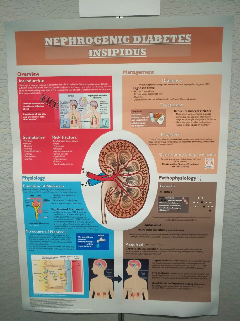
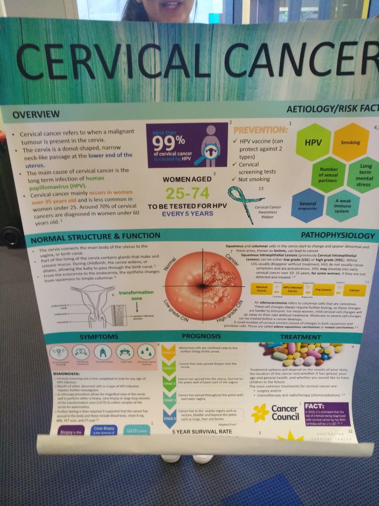
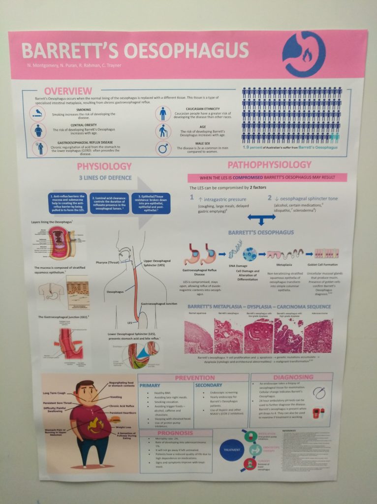
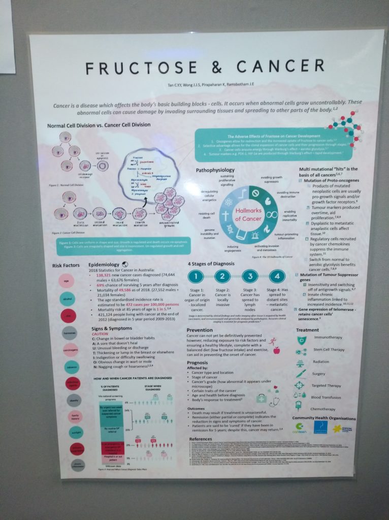
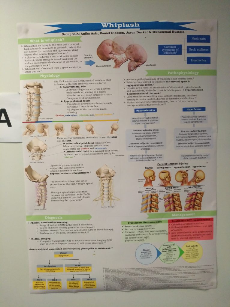
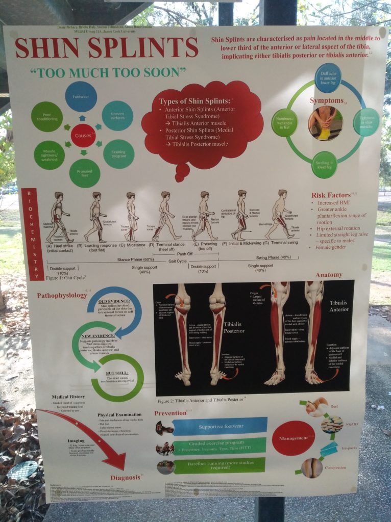
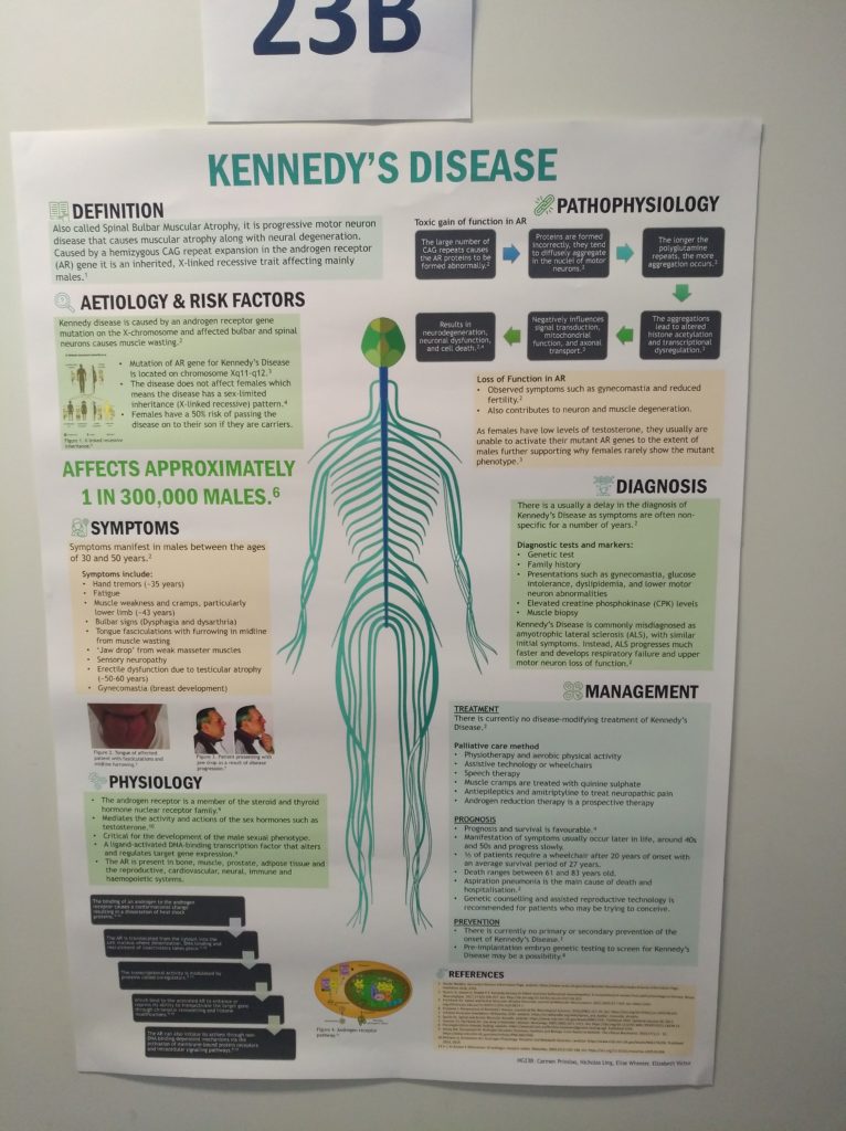
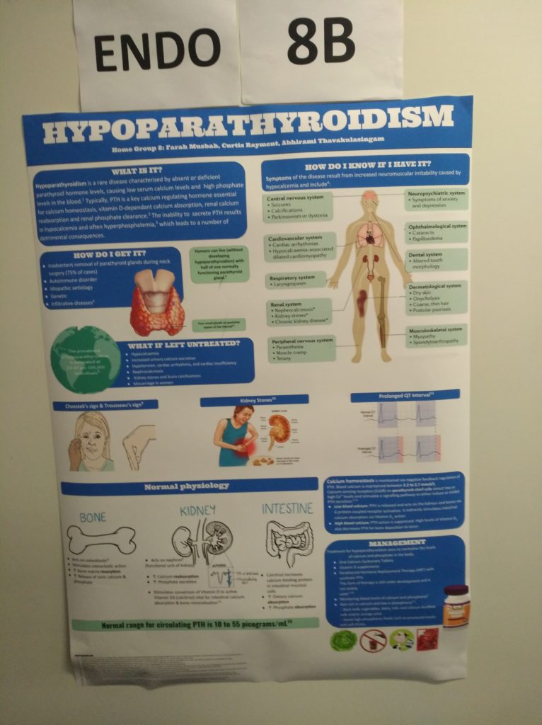
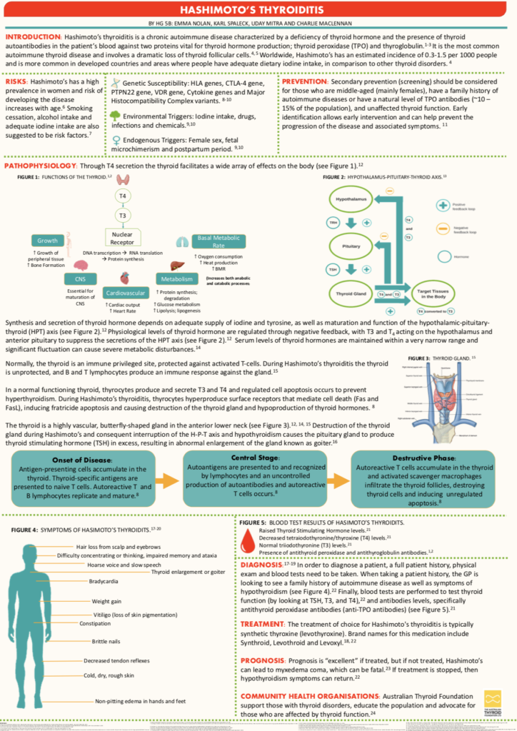
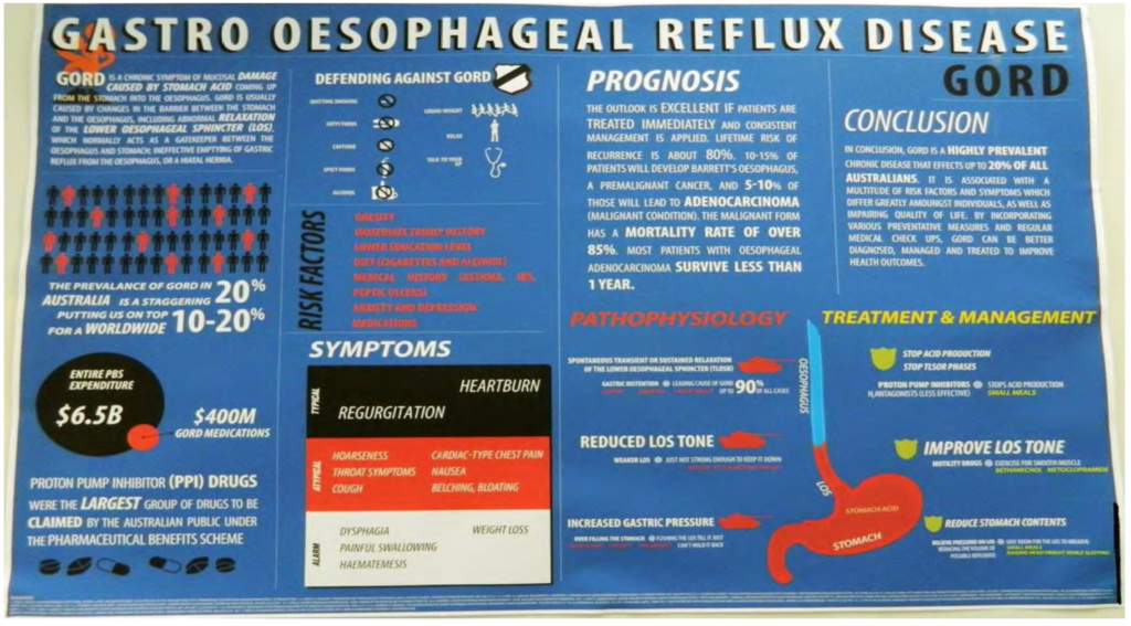
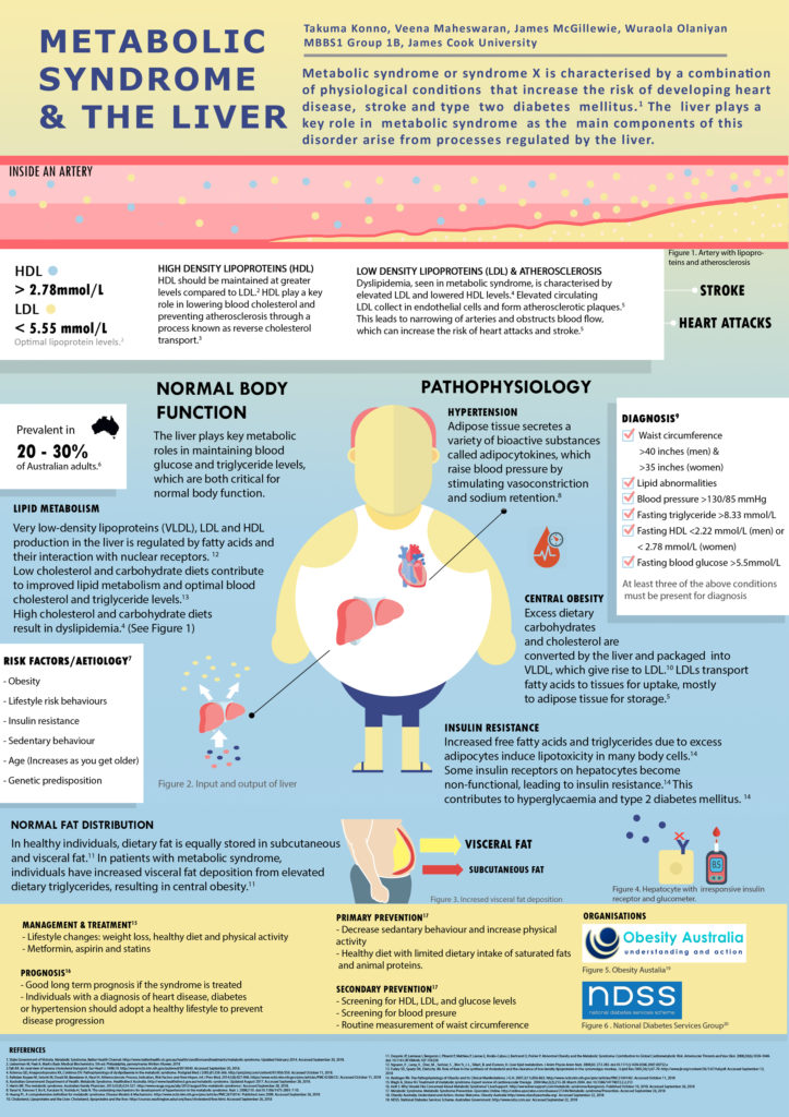
Here are some very good examples of posters that create an appealing picture and demonstrates well the information. There is a good choice of colour with the right choice of pictogram. The readers can easily follow the information that has been given and sections are adequately made. In-text referencing is done appropriately. However, some could be improved by reducing the number of words on it:

A medical poster with a slick design
Using applications such as Canva, Photoshop, Adobe Illustrator and even PowerPoint can give you that clean and slick design that your poster deserve. Remember, you do not want to look hard to find the information. The information should "pop" and demonstrate its content. A poster should pique your curiosity and bring its point across successfully. Try to imitate these examples below and add some of your own design.
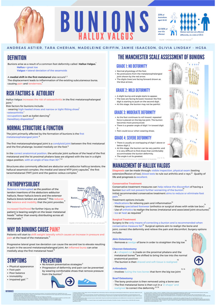
Example: Bunions, Hallux Valgus.
This poster used Canva and Photoshop for resizing (click on the poster picture for a bigger image).
good title that is easy to read.
the names and the group number are present.
clear flow, same fonts and the sections are divided accordingly.
easy to read, the right choice of colours and an appropriate language.
right choice of pictograms.
notice how the blue letters represent important words and the red letters represent pathophysiology words.
correct referencing.
all sections are neatly segmented.
overall a very good poster.
Example: Metabolic syndrome and the liver.
This poster used Adobe Illustrator and Photoshop (click on the poster picture for a bigger image).
easy to read with an appropriate language.
interesting to read and makes the reader want to know more.
good in-text referencing with good flow through the poster.
interesting colours use.
no spelling mistakes were present – it is always a good idea to get some ‘fresh eyes’ to read through your work – a friend, colleague, etc. Spelling mistakes might seem insignificant but they can detract from the general impression of the quality of the work.
overall this poster is very good.
My final say
I hope that this guide was useful and good luck on making your poster!
Published 30th October 2018. Last reviewed 30th December 2021.


